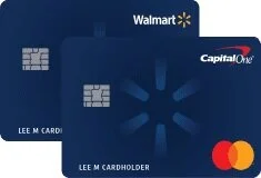
Capital One Walmart Credit Card
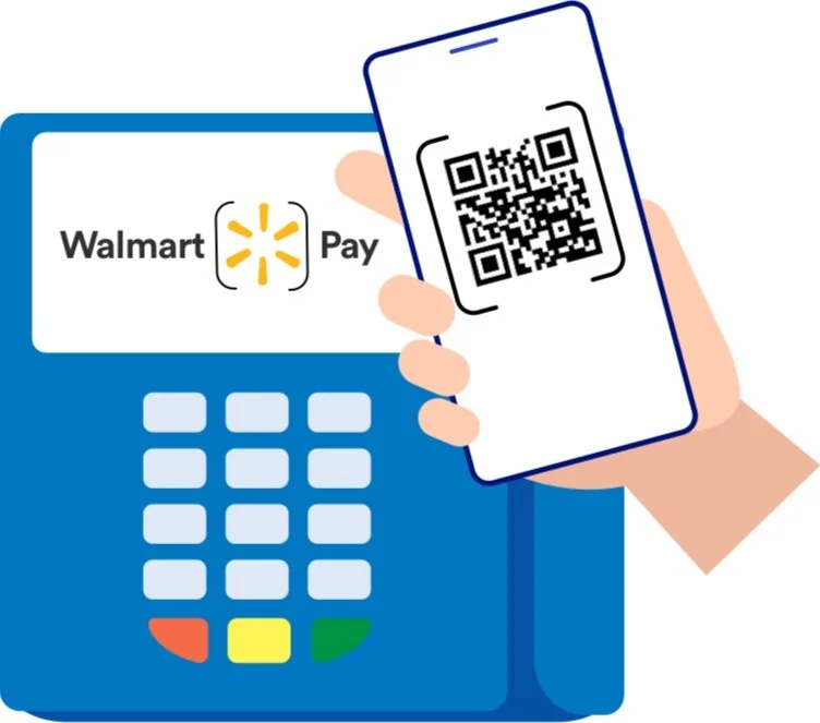
Walmart Pay
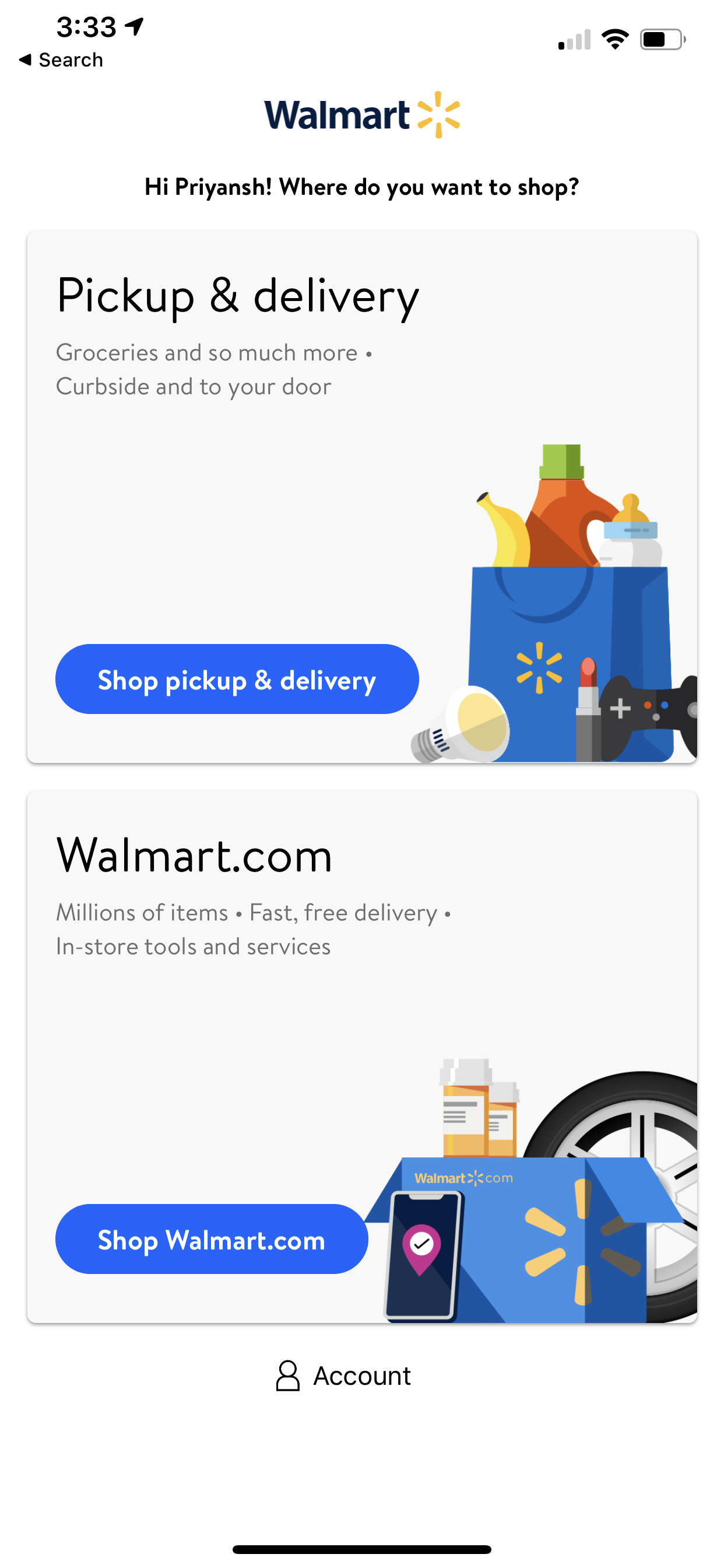
🟩 Walmart Pay - Value Proposition / Onboarding Screen Design
Situation ▼
From the previous data (Analytics team, Quantitative data and previous user survey) it was determined to redesign the Value proposition and onboarding flow of Walmart Pay .
However the challenge was to ensure its improving the drop off rate and helping the users get through the conversion funnel.
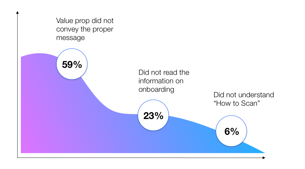
The Problem
From the previous Analytics team the conversion drop-off was shown to 59% as most of the users landed on the scanner with almost no knowledge/information on Walmart Pay
From the previous user testing data (acquired from the UX Researcher) Users did not understand the relationship between the Scanner and QR code.
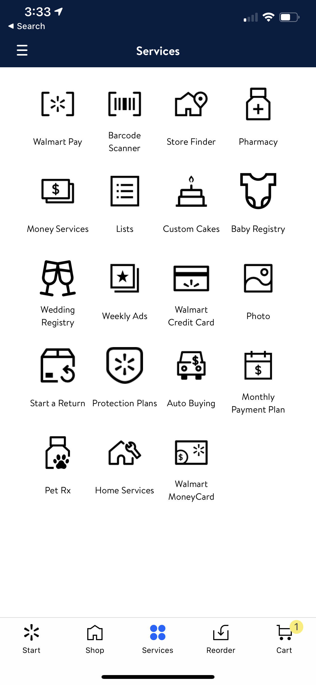
Task 🗓
To create a end to end user flow of a new user focusing on the onboarding, conversion and usage of Walmart Pay
Action ⏩
Step1
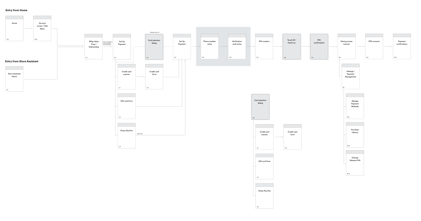
I mapped out all the action points by highlighting the cause and the effect screens considering the entry point Walmart app.

Step 2
To create a Value Prop and Onboarding screen that is
a - Easy to understand
b - Speaks customer friendly language
c - Highlights “What is in for me”
2.1 - Gathering Quantitative Data
Sources -
a. Analytics Team
b. Survey Data
c. Slack Channel ( Comments On Walmart Pay Channel)
d. Competitive Market Analysis
2.2 - Qualitative Data Gathering
Sources -
a. UX Researcher Team meetings
b. Previous usability test results
c. User testing affinity diagramming overview
Key takeaway


Visual Design - Value Prop
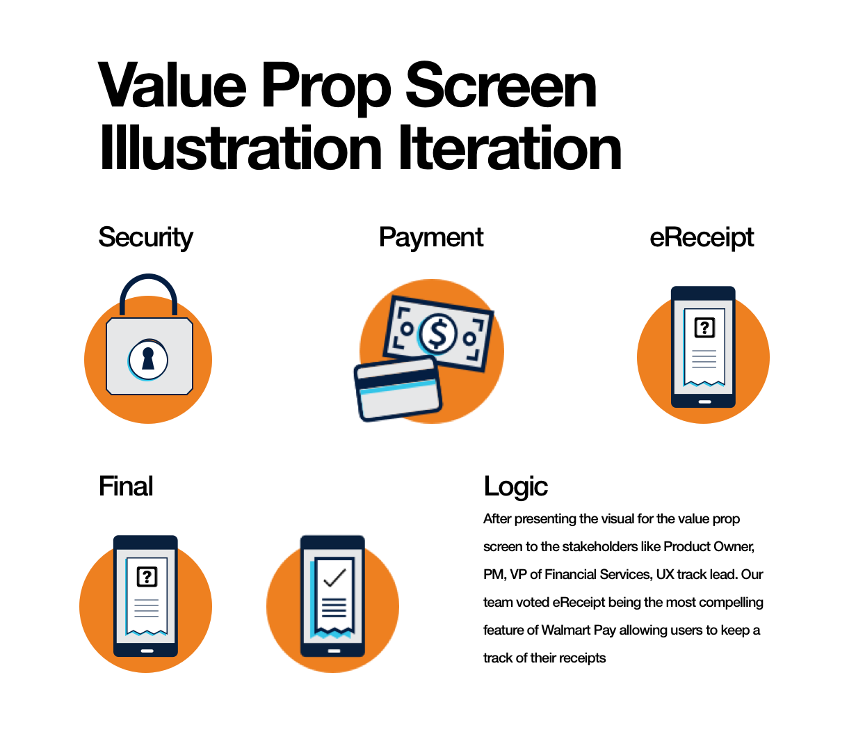
STEP 1 - Because of our creative directors busy schedule, after structuring the content or the value proposition screen, my goal was to ideate few concepts and get it finalized from the Creative director and present the approved designs in the next sprint meeting.
Step 2 - Understanding the Do’s and Dont’s of Walmart’s visual design guidelines
1. Simple shapes
2. Complementary Color Scheme
3. ADA Compliant
4. Less Sharp
5. Symmetrical
6. No Complex Shape
7. No Grains/ No Texture
Final Screens

Interaction
Interaction: the screen slides from the bottom
1. Closes the screen: screen slides to the bottom, takes user back to Services.
2. CTA: ‘Get Started’: opens a sign in / create account if user not signed in
OR takes user to ‘Payment Methods’ if they are signed in
What did I do?
Collaborated with the Content Strategist to build our value prop
Understood what matters to our users and used the information in our value prop, i.e
1. Users want a faster an seamless experience
2. Users like to have choices
3. Users are tired of showing receipts while leaving the store.
4. Users also find it difficult to keep a track of their receipts and manage them for creating returns as well.
What did I do?
Did some iterations as per the design system guidelines
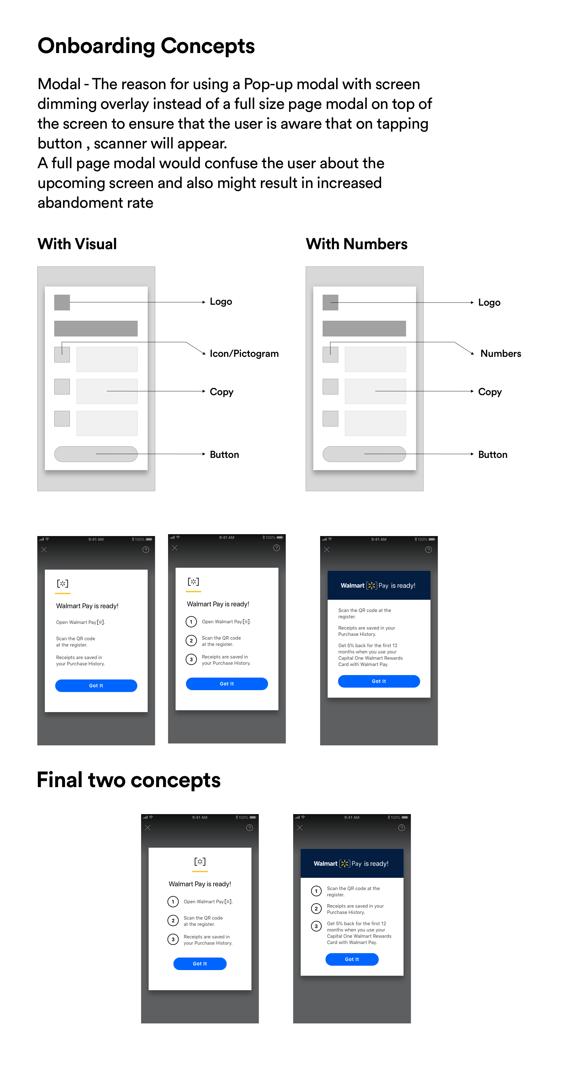
Chose to put modal overlay instead of full page view on top of the screen
Facilitated a meeting highlighting changes in the onboarding screen to understand the POV of stakeholders
Highlighted a need for CapOne Entry point in the onboarding screen
(Did not work out well because CapOne WCC was still new for people to understand)
Interactions
Result 📈
From 59% to 76% of our users were able to complete the task now which was considerable amount of increase in the number converging through the funnel
I Designed the whole new flow starting from the Walmart app with given user scenario criteria below
- User is not logged in
- User is new to Walmart Pay
- User does not have existing payment methods
- User adds a payment method
This structure was appreciated as it became a source of truth for further iterations as it was the first flow where value prop and onboarding were tested together which I mapped out