
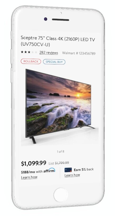
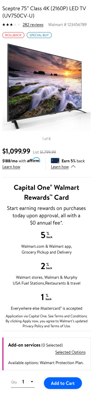
🟩 Capital One Entry Point - Itempage
Itempage - Walmart eCommerce
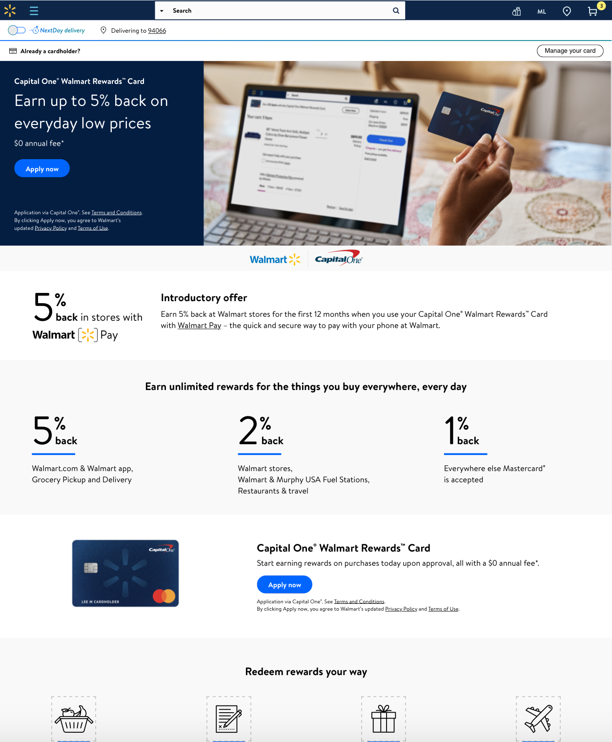
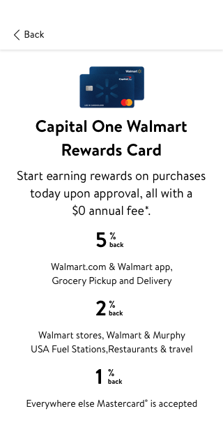
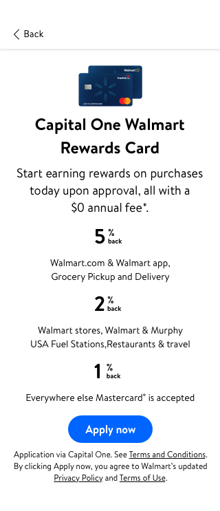
Walmart Credit Card - Capital One Landing Page
Situation ▼
Users tapping on the Learn How button for the “Capital One Walmart Credit Card Entry Point” were navigated to the rWeb version of the Landing Page.
The issue is many users end up NOT returning back to the Itempage, which is a bigger problem as the key goal is that customer completes a purchase without being affected by any Entrypoint of an offer
Data 📊
46% of our users who buy products that are “Credit eligible” clicked learn how (Capital One Entry Point - ItemPage) and our return rate was almost near going down to the single digit 11%
Task 🗓
How might we ensure that the users tap on learn how > Apply for the Credit Card / Stay on the Landing Page > Return back to the Itempage and (possibly) add the item to the cart
Action ⏩
Reached out to the analytics team to understand
1. Our Landing Page’s conversion rate - which turned out to be as expected.
2. ItemPage Conversion - Since we have two credit offer entry point - Affirm and Capital One, I verified the behavior of affirm and how does it differ from our entry point.
3. Started creating concepts
Concepts 💡
My first step was to apply the best UX practices that would apply to the solution with no limitations
Concept 1 - Drop Down
I created a drop down version where the user is not redirected instead they see the information that would matter to them either to apply for WCC or get enough information to reconsider it later.
Left Aligned - Smaller Font
Left Aligned -
normal font
Centre Aligned
Concept 2 - Dialog Box
I designed a concise version of the Landing Page that would appear as a FULL PAGE DIALOG BOX on top of the Itempage screen
Center Aligned
Center Aligned with “Apply now - button”
Left Aligned with “Apply now - button”
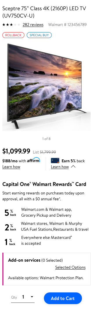
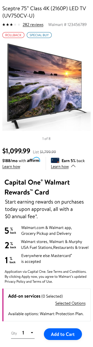
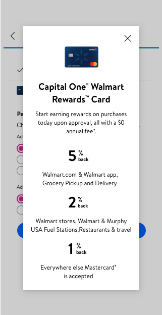
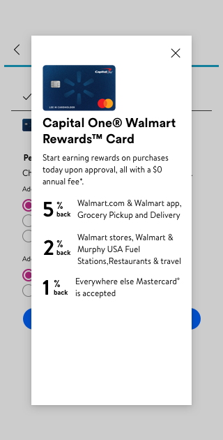
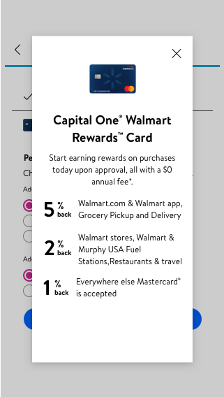
Concept 3 - Overlay Modal
Center Aligned
Left Aligned
Center and Left Aligned
Evaluation
I presented my concepts to my team and stakeholders from Capital One. I facilitated the meeting highlighting +ve and -ve of each design solution.
I ensure our team aligns to one final solution so we can utilize the solution in our upcoming test.
My inclination was more towards the concept 3 - Overlay Modal on top of the Itempage screen with “Apply now” button
Why?
To ensure that the user tap on “learn how” and the behavior is more knowledge centric and precise as opposed to redirecting the user to a new page altogether
Both the credit entry points “Affirm” and “Capital One Walmart Credit Card” will have the same behavior
User get time to read the information and overlay modal gives easy access to move back to the previous screen.
Results 📈