Walmart Pay Optimization
Walmart Pay is the “Poor man’s version of Apple Pay or Google Pay” — it’s only good at Walmart Stores. As a business we wanted our customers to use it because it:
Gave us a treasure trove of data allowing us to tie individual customer data to their purchases across online and in-store visits
Had proven to act as a “gateway drug” to other in-store services
Was becoming a platform for various money-saving opportunities (ibotta, Chase Pay, etc.)
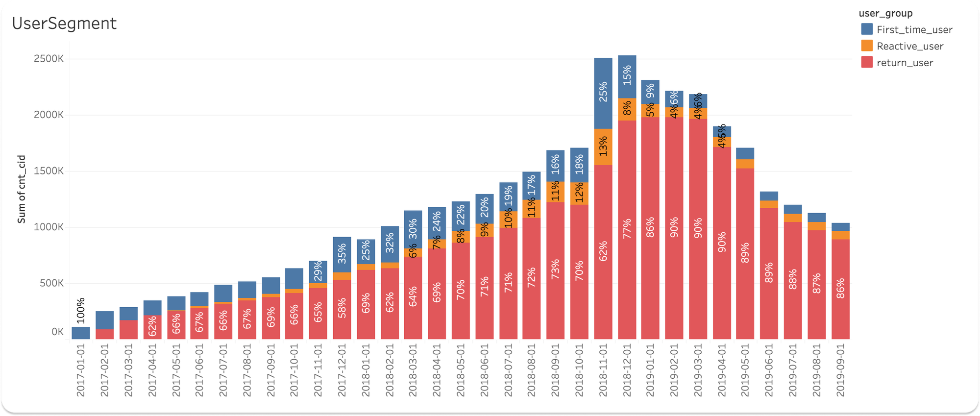
However, the data was telling us there was room for improvement, as we were seeing a massive drop in engagement after a legacy savings method was disabled.
Digging in further, we identified two major problems:
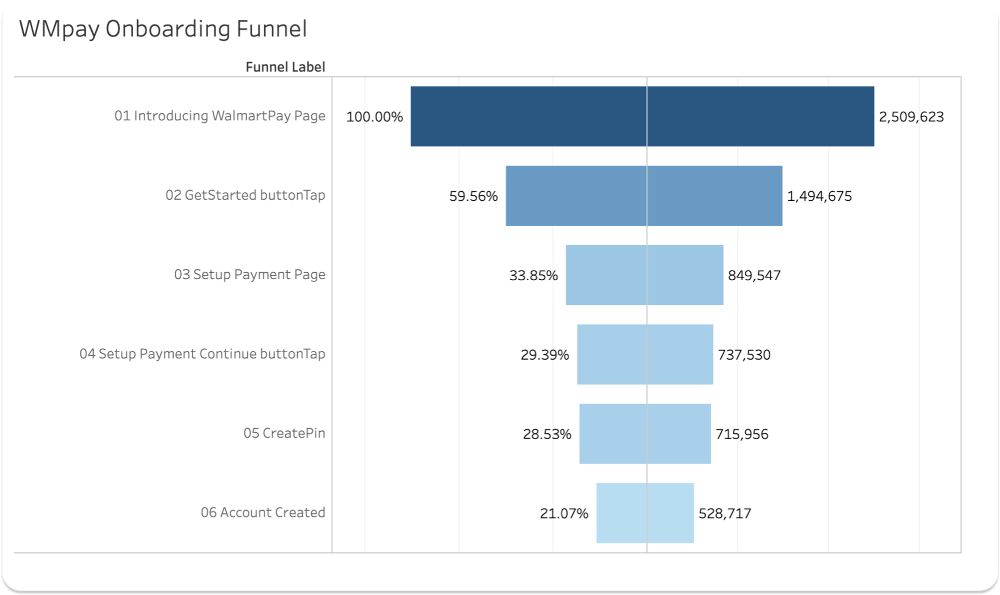
Problem One: Only 1 in 5 users complete onboarding
Intro to Get Started loses ~40%
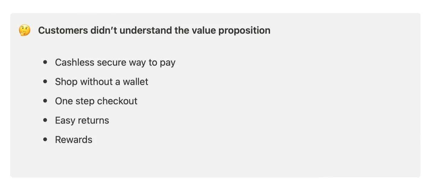
Is this an issue with value prop? Is there intent to complete it later? Are they getting to this page accidentally or just out of curiosity?
Get Started to Setup Payment loses ~26%
Do they not have what they need to set up? Is it too difficult to complete at the time? (for example, if they are in the store)
Research // Customer interviews
What do you think Walmart Pay is?
“Like Samsung Pay but owned by Walmart”
“… assume I can use it most place.”
“… like a Walmart credit card, but digital?”
How do you think it works?
“A credit line. You apply for credit through the app.”
“You add money into it. Show the phone and it grabs it”
What are the benefits?
“It would be nice if it gives incentives and discounts.”
“Maybe its more secure?”
“Offers a faster checkout”
What are the drawbacks?
“I’m not comfortable connecting my cards to it.”
“I don’t see any benefit beyond swiping my card.”
“Connection problems. You have to try to read the phone again.”
How do we fix this?
Proposed solution
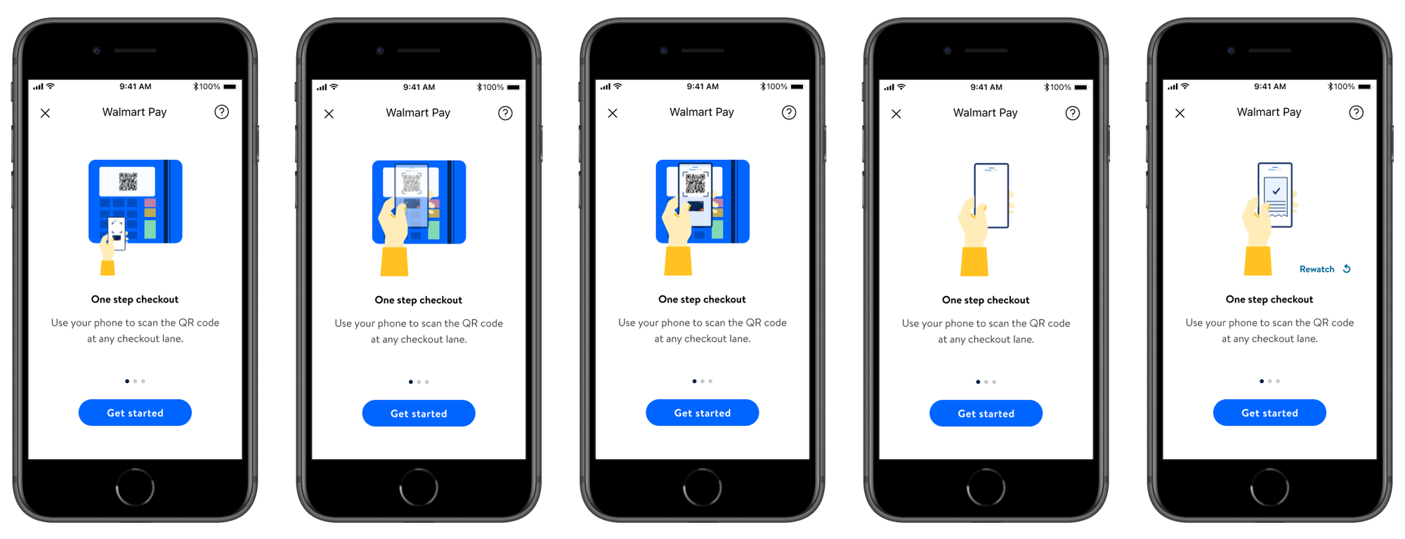
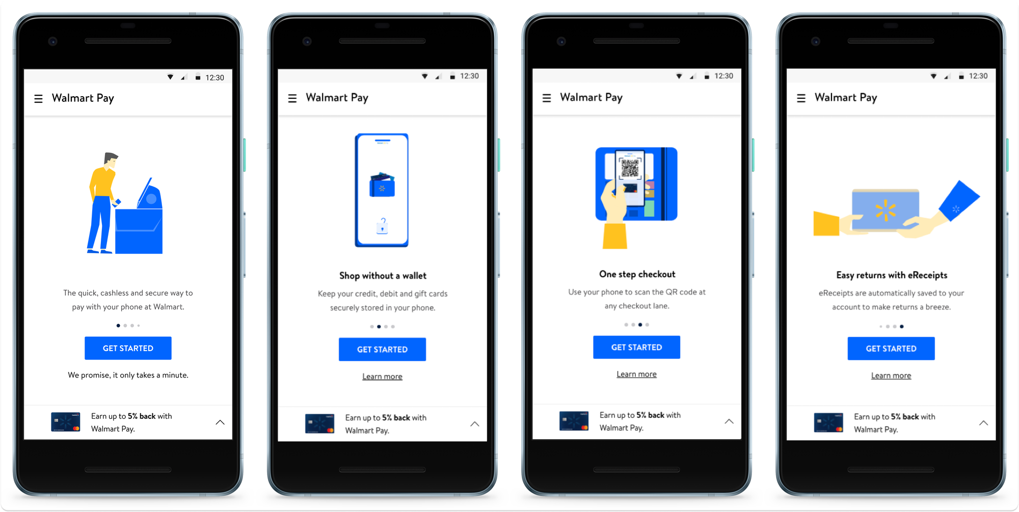
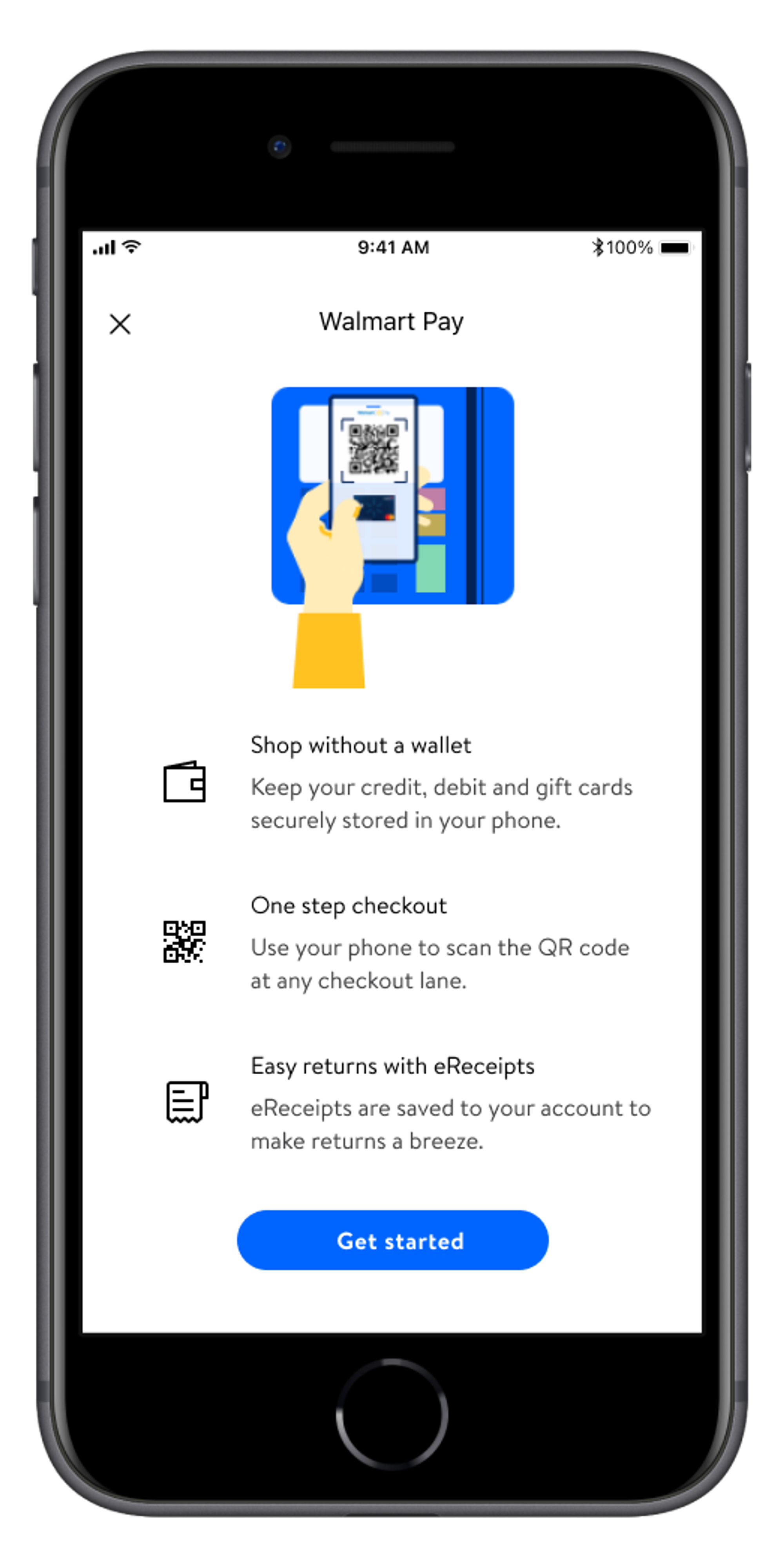
On startup, what if we laid out all of the value props in a carousel with attractive illustrations to encourage engagement?
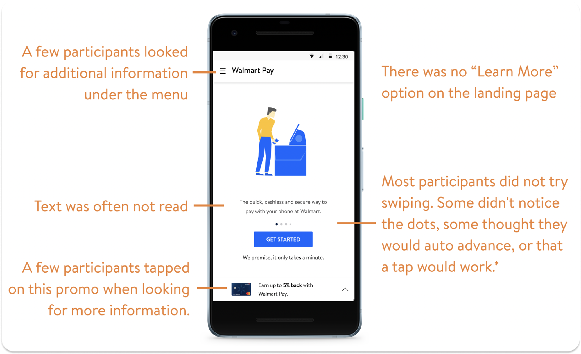
No. It didn’t work - at least not this version.
Users did not even notice the carousel function, instead focusing on the big blue ‘Get Started’ button.
Variant 2
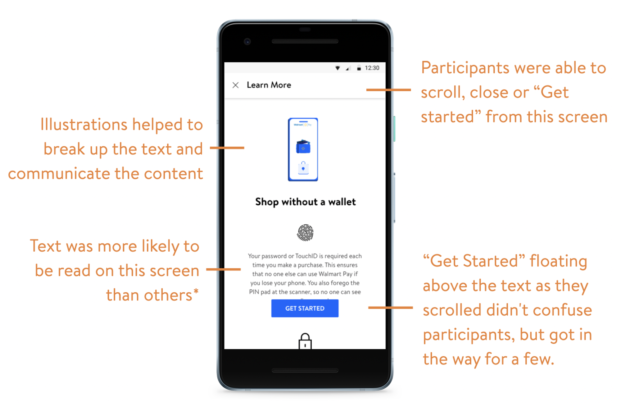
How about another version that brings ‘learn more’ into the mix?
Testing Variant 2
But did it work?
Not really. Customers still went right for the Get Started button. But if they did find ‘learn more’ they were more apt to read it.
Testing Variant 3
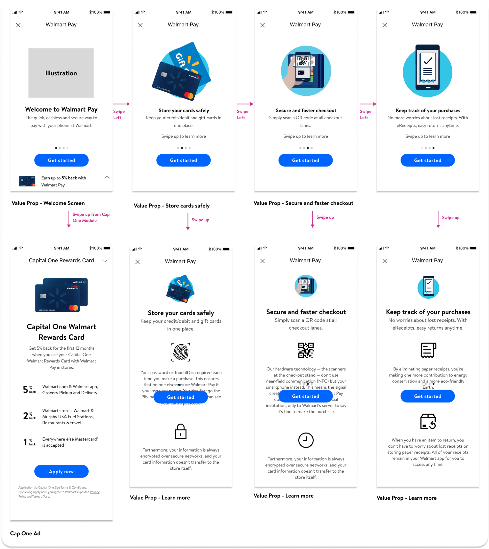
What if we forced them to work through the carousel?
This version did result in a higher grasp of the value proposition, but it also slowed down the customer and we risked abandonment.
Ultimate design
Surprise, surprise, we simplified it.
Ultimately we went with a Goldilocks version that listed the most compelling value props on the landing screen along with a ‘Get Started’ button for quick onboarding.
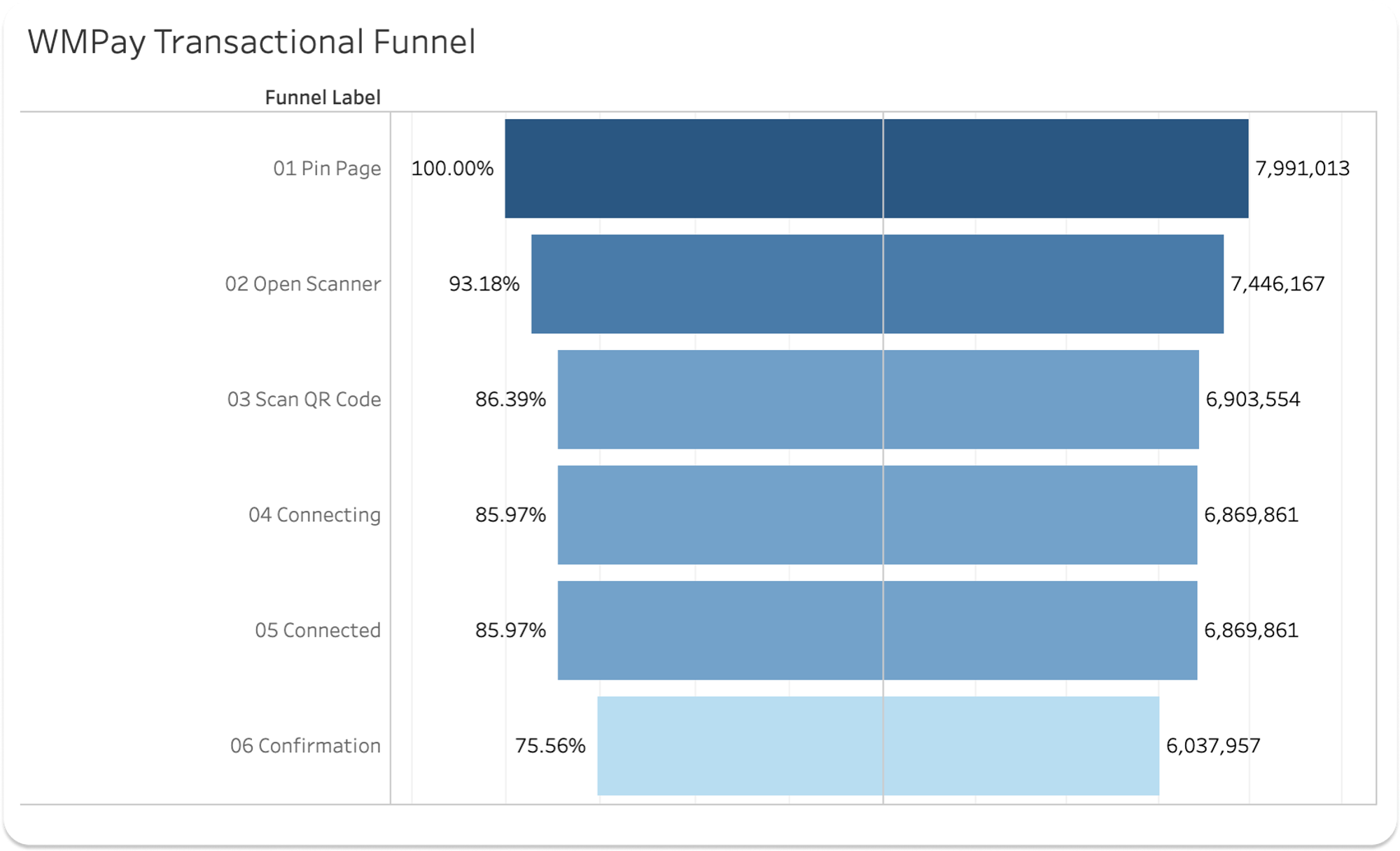
Problem Two: 25% of transactions are not completed
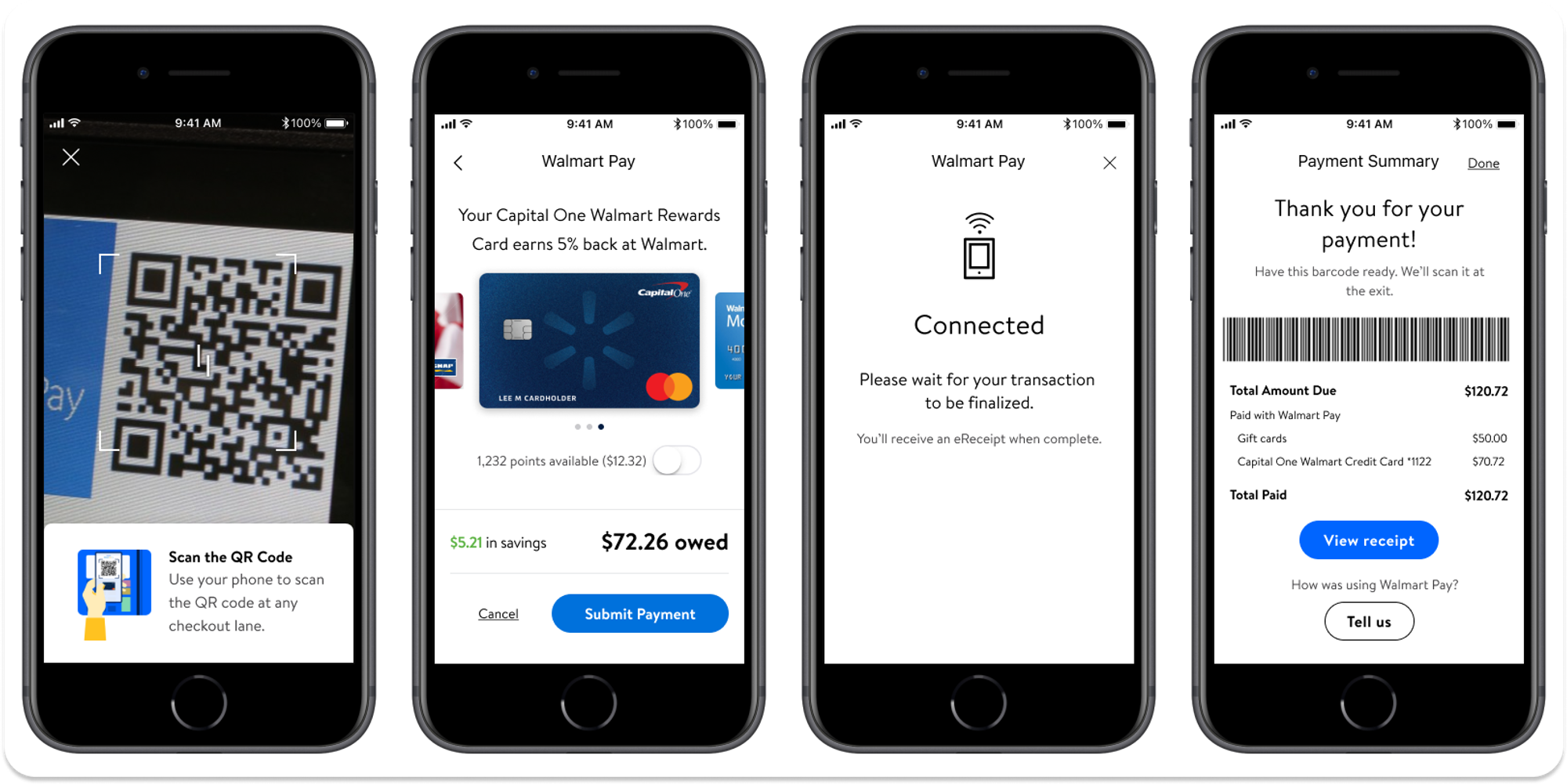
Connected to Confirmation loses 10%
3-4% of this is attributed to card declines
Assume the remainder are connection issues
Pin page to Open scanner and then Open scanner to Scan QR code each lose 7%
Forgotten PIN? Do they need to update their payment method and abandon?
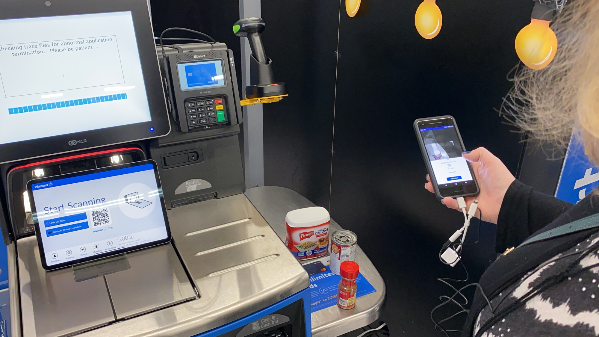
Do they not understand how to scan the QR code?
Since we can do little about card declines or connection issues, we focus on the scanning interaction to see if we can make up 7 - 14% of lost transactions.
We also had a hypothesis that users were uncomfortable using Walmart Pay because it almost worked “too fast” and could elicit a feeling of losing control. We wanted to test whether we could improve our transaction funnel by introducing more control.
Proposed solution testing
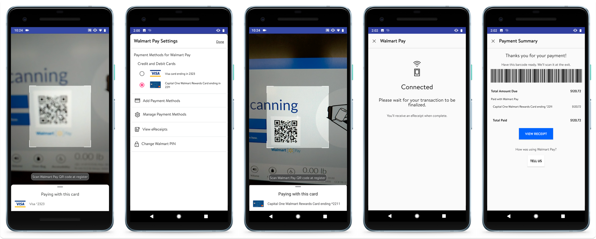
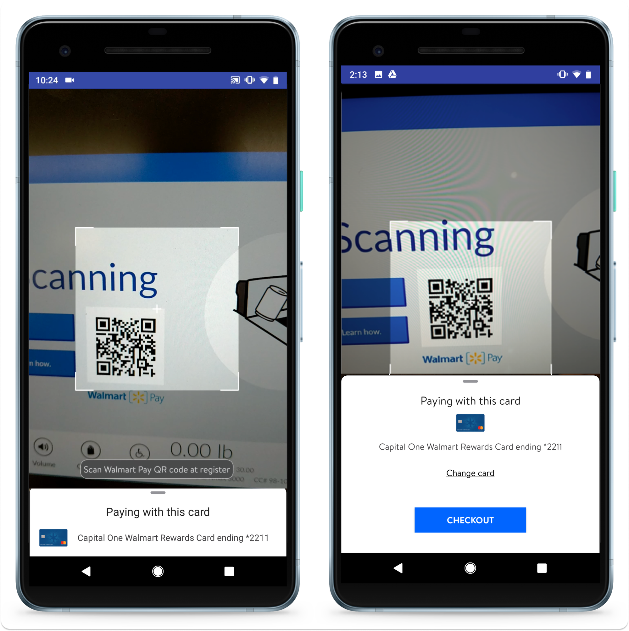
Control version / “In Prod”
This version would actually connect without any interaction, so if your camera caught even a glimpse of the QR code, the payment would go through with your default card automatically.
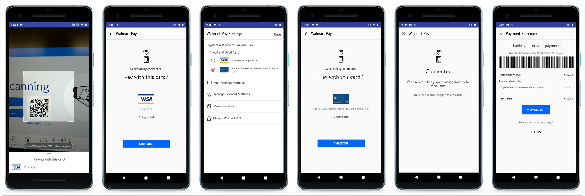
Test Version A
Disabled the scanner until after payment was confirmed
Added a new step to confirm payment method prior to Connected state
Test Version B
Added a new step to confirm payment selection
Moved payment confirmation after the Connected state
Testing results
Majority of users preferred Version B
“[Production] was a little ahead of where I wanted to be. I would prefer [Version B]”
“The extra step in [Version B] gives me comfort that it processed properly.”
“Checkout” button label didn’t compute
“’Checkout’ doesn't convey what I have to do.”
“'Checkout' means ‘scan'. Pay means ‘finish’.”
“'Confirm' means ‘you already took the money’.”
You can’t please everyone!
When viewing the small bottom-sheet
“It would be good if it gives you the card info higher.”
“The card info could be bigger. . . I’d like to see the other cards available."
When viewing the large bottom-sheet
“It takes away from the QR code scanning space.”
“It should not take half the screen. It still says pay with this card.”
Other problems
Customers still didn’t process that Walmart Pay is just another payment method, like cash or a credit card.
A few thought they needed to tap the QR code on the SCO so they could scan the code
A few didn't know to press “pay” on the SCO after scanning their items
Some thought they had to scan the QR code before scanning their items
One thought she would scan her items with her phone
The ultimate solve
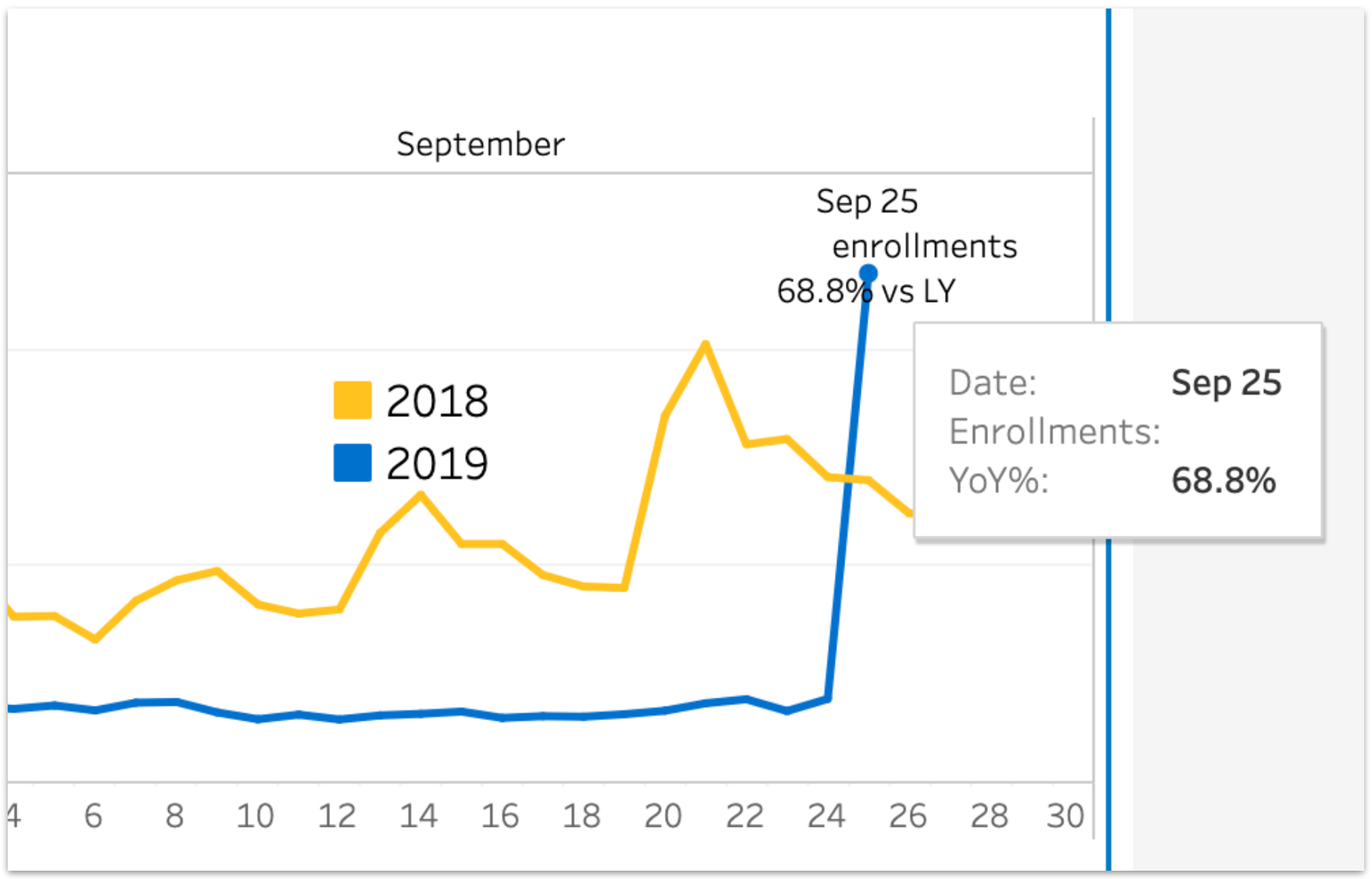
Results

