What needs attention?
Limited visual hierarchy made it harder to distinguish a critical issue from routine operational information.

Helping engineering teams connect service health, dependencies, and recovery in one operational workspace.
Select a service, inspect its relationships, and preview a recovery action. This interactive walkthrough demonstrates the UX with sample data.
No matching services. Try “checkout” or “identity”.
Sample services and simulated actions. No connection to production systems.
The previous monitoring interface exposed technical information, but made engineers work to connect the signals. Important alerts competed with dense lists, navigation took effort, and service relationships were difficult to follow.
Limited visual hierarchy made it harder to distinguish a critical issue from routine operational information.
Service details and dependencies needed to become part of a coherent investigation.
Engineers needed a clearer connection between understanding an incident and finding the relevant controls.
Help engineers recognize important changes, understand the affected service, and reach a useful next action while retaining context.
I combined stakeholder interviews, power user feedback, workflow observation, and competitive review to define the experience. The work focused on monitoring, dependency mapping, and recovery.
Clarify operational needs and the goal of improving time to recovery.
Understand the information engineers rely on and where navigation interrupts their work.
Move from early prototypes into detailed layouts, incorporating usability feedback.
Resolve interaction details and adapt the design to technical constraints during delivery.
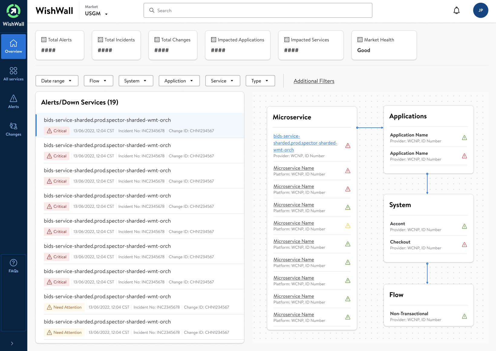
The redesign brings status, filters, alerts, and linked service context into the dashboard. The layout helps users narrow their focus before moving into detail.
I explored overview and table layouts for distinct operational tasks. Browse the original screens to see how context, density, and actions change with the work.
An alert list paired with microservice, application, system, and flow context. This direction emphasizes relationships during triage.
Click the screen to enlarge ↗
The redesigned service view pairs core information and operational controls with recent activity. Engineers can assess the current state and review what happened in the same context.
Service information establishes the subject of the investigation before presenting actions.
Recent activity and alert trends bring operational history into the detail view.
Relevant operations sit alongside the information needed to evaluate the next step.
The redesign establishes a more connected experience through clearer status hierarchy, task focused navigation, contextual service details, and accessible controls.
An observability interface should help engineers move through a decision: notice the issue, understand the relationships, and act with context. The design succeeds when that sequence feels continuous.
The next validation step: measure time to identify an affected service, navigation effort during investigation, and completion of recovery tasks. Quantitative impact is not reported in this case study.