
Prevent, optimize, and resolve application issues

Overview
Prior to the introduction of the WishWall dashboard, the engineering team at our company utilized a Material UI-based monitoring interface that was inadequate for our needs. The earlier dashboard presented a range of usability and functional limitations

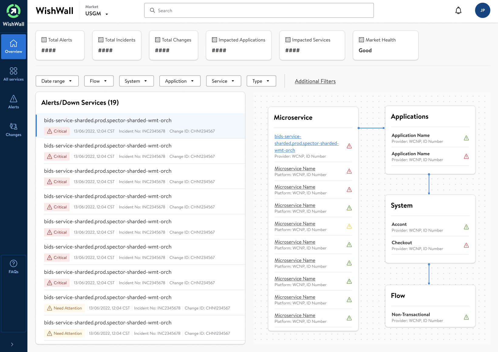
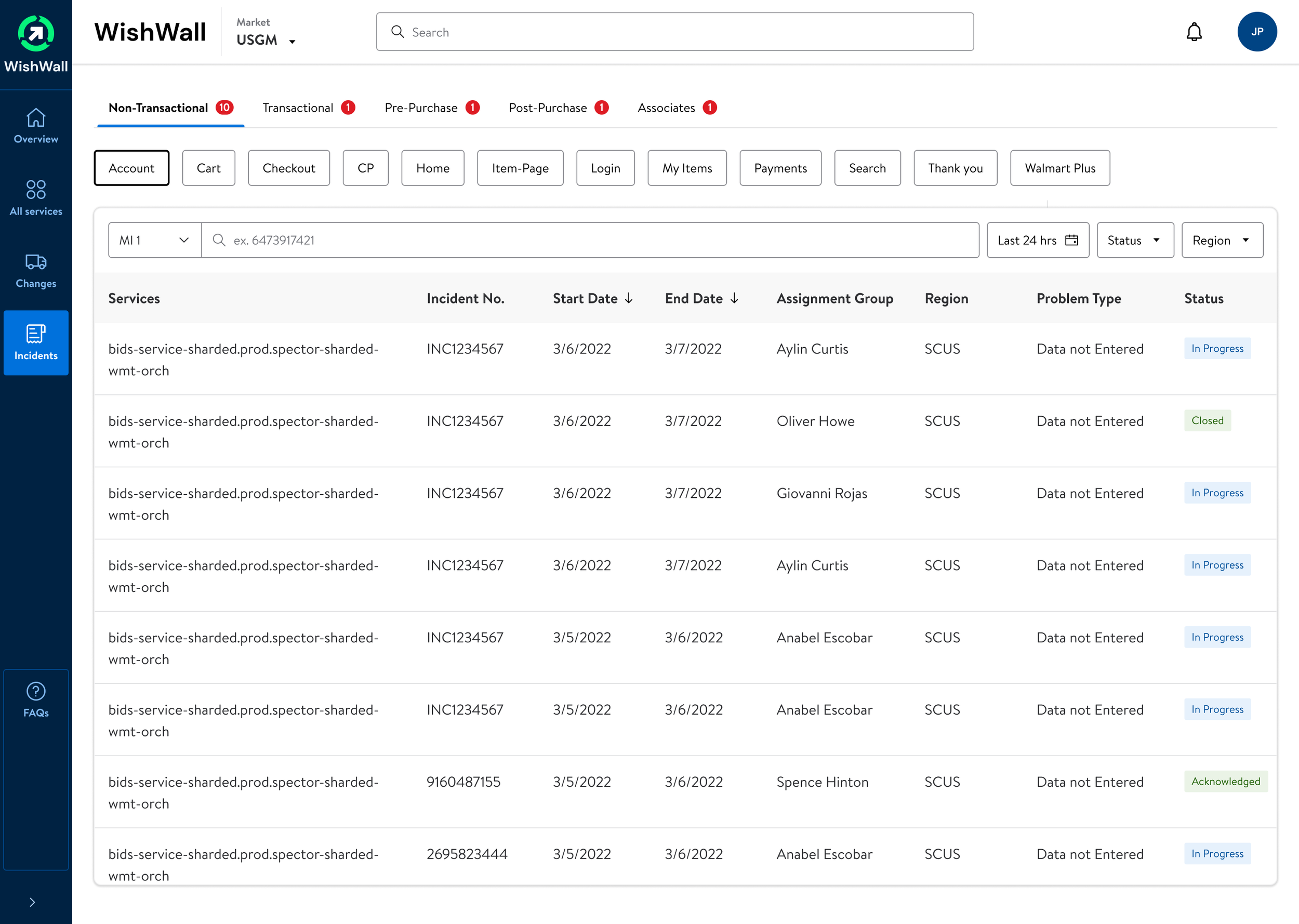
Lack of Intuitive Data Visualization: Critical information such as system alerts and incidents was buried in lists without clear visual prioritization, making it difficult for users to quickly assess the status of services.
Inefficient Navigation: The navigation structure required multiple clicks to reach essential information, resulting in a time-consuming and frustrating user experience.
Poor Alert Management: The alerts were not categorized effectively, lacking clear distinctions between critical and non-critical issues, leading to inefficient incident management.
Absence of Real-Time Data Synthesis: The inability to synthesize data from various sources in real-time meant that the dashboard could not provide a holistic view of system health.
Limited Customization: The dashboard had minimal filtering options, which impeded the users' ability to tailor the interface to their specific monitoring tasks.
Suboptimal Use of Screen Real Estate: The layout did not make optimal use of space, leading to a cluttered interface that obscured key information.
These issues compounded to create a significant challenge for the operational teams responsible for maintaining system uptime and efficiency. There was a clear demand for a dashboard that provided an intuitive, comprehensive, and real-time view of the system's health.
Old
New
Process
Initial Stakeholder Interviews:
Conducted one-on-one interviews with key stakeholders to gather insights into business requirements, expectations for the tool, and desired outcomes.
Clarified the objectives, such as the need for improved MTTR, and established the success metrics for the dashboard.
Power User Interviews:
Interviewed power users to gather detailed feedback on the existing system’s limitations.
Observed their interaction with the current dashboard to understand their workflows, pain points, and features they relied on the most.
Competitive Analysis:
Reviewed competing products and industry benchmarks to identify best practices and innovative features that could be adapted for the WishWall dashboard.
Requirement Gathering and Analysis:
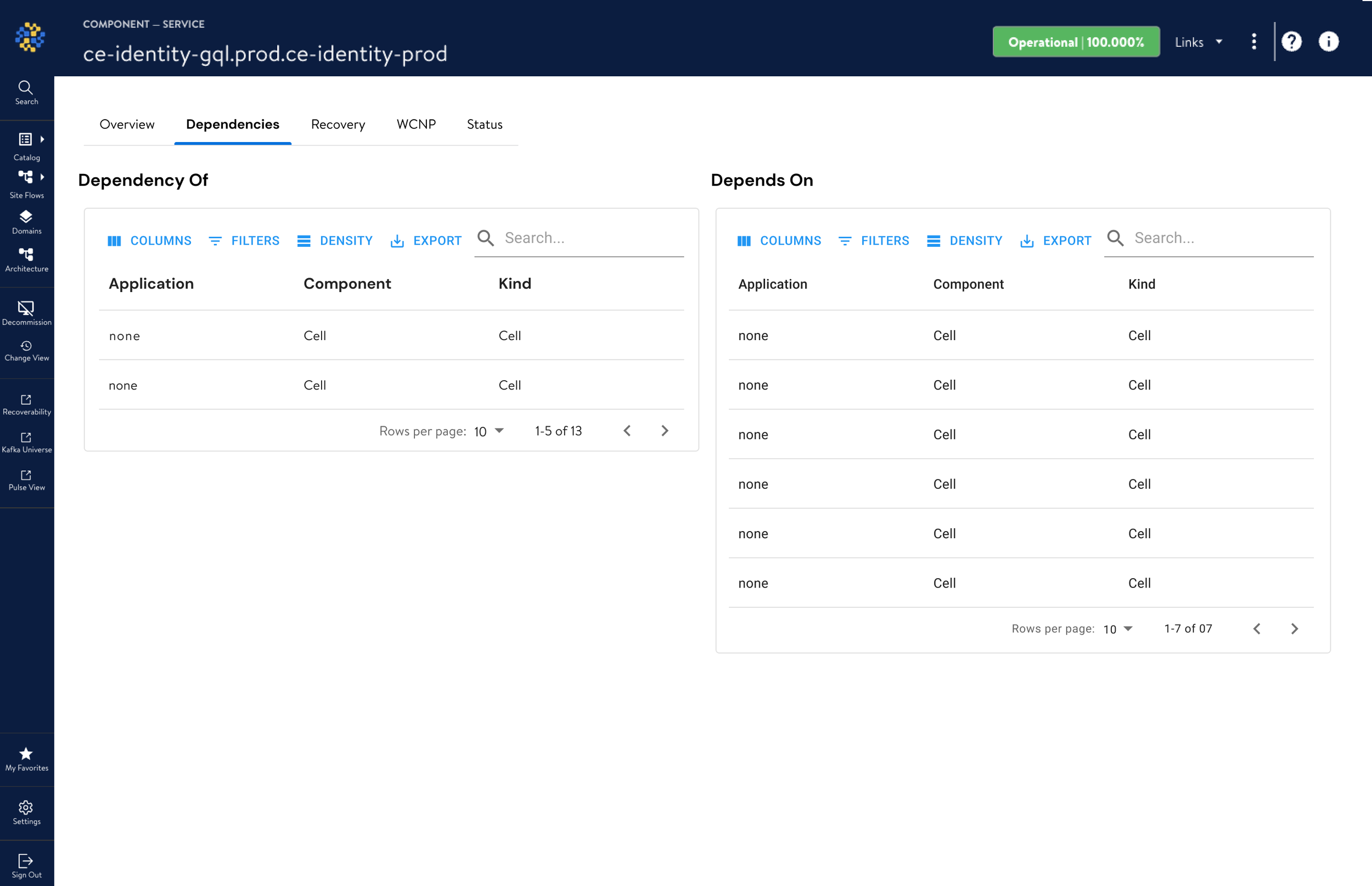
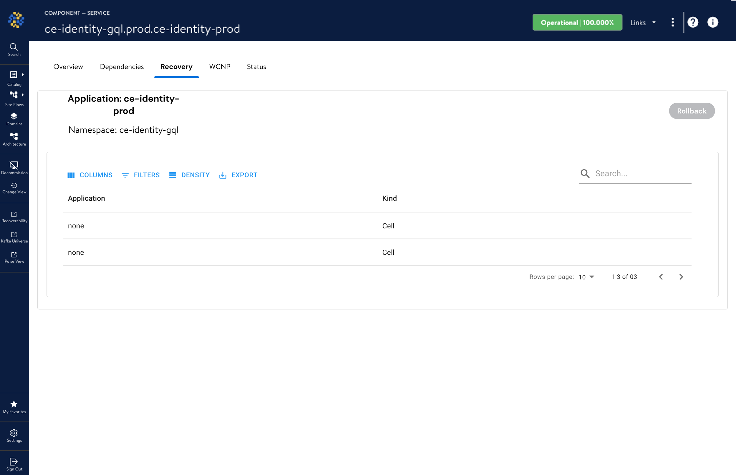
Mapped out the requirements from the interviews, focusing on critical features like real-time monitoring, dependency mapping, and recovery actions.
Prioritized these features based on user needs, frequency of use, and impact on the troubleshooting process.
Prototyping:
Developed low-fidelity prototypes to test hypotheses and design assumptions quickly.
Iterated on these prototypes, gradually increasing fidelity and incorporating interactive elements to simulate the dashboard experience.
User Testing and Feedback Loops:
Conducted usability testing sessions with a focus group of end-users, power users, and stakeholders, observing their interactions and gathering qualitative data.
Implemented a feedback loop to refine the dashboard iteratively, ensuring the design met the user's needs effectively.
Design Refinement:
Used the insights from the testing phase to refine the user interface, optimize the user flow, and ensure that the information architecture was intuitive.
Worked on the visual design elements to ensure that the dashboard was not only functional but also aesthetically pleasing and aligned with brand standards.
Collaboration with Developers:
Worked closely with the development team to ensure that the design specifications were clearly understood and implemented correctly.
Participated in agile sprints, providing design support and making adjustments as needed based on technical constraints and new findings.
How this design helped the stakeholders
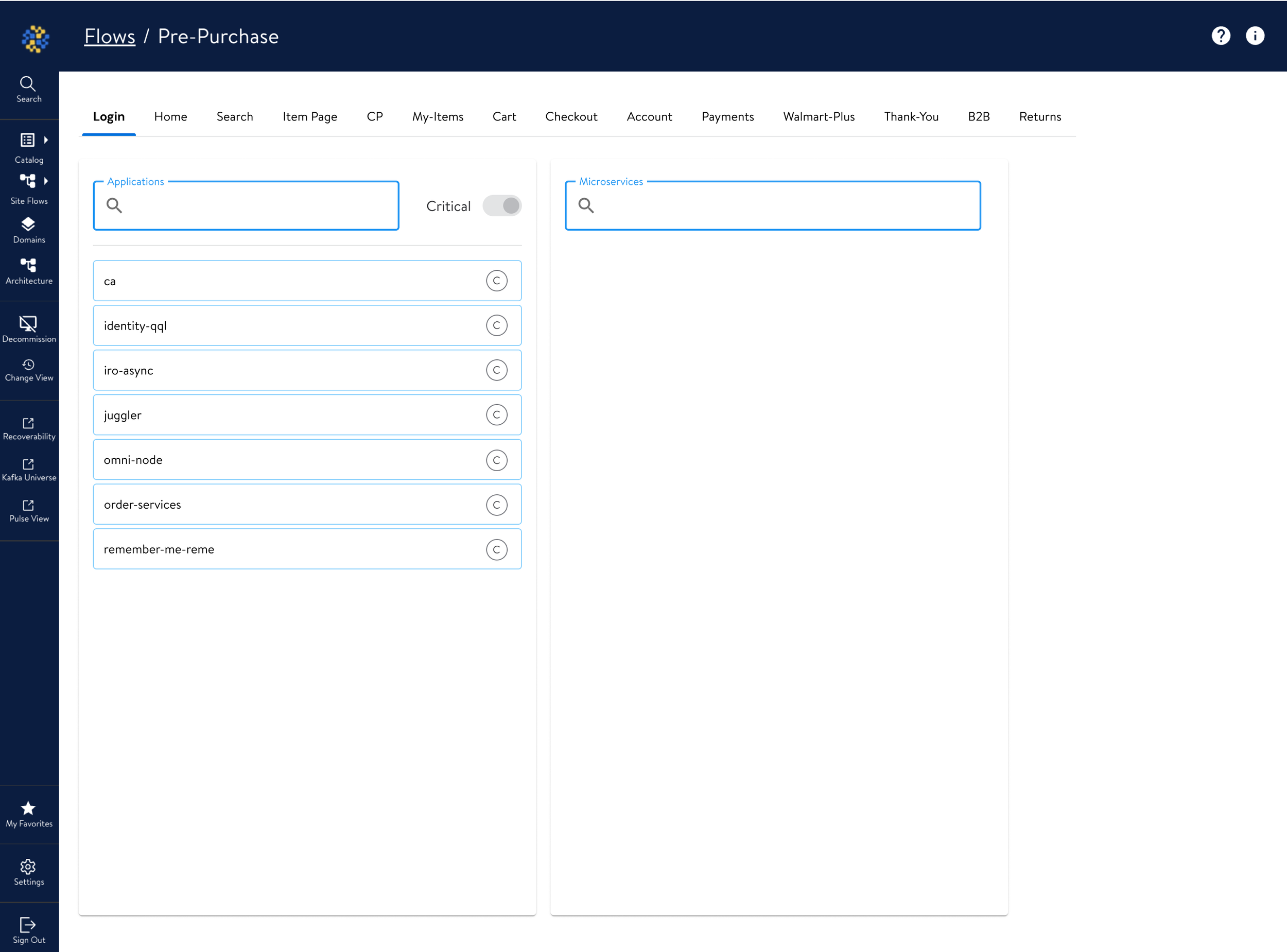
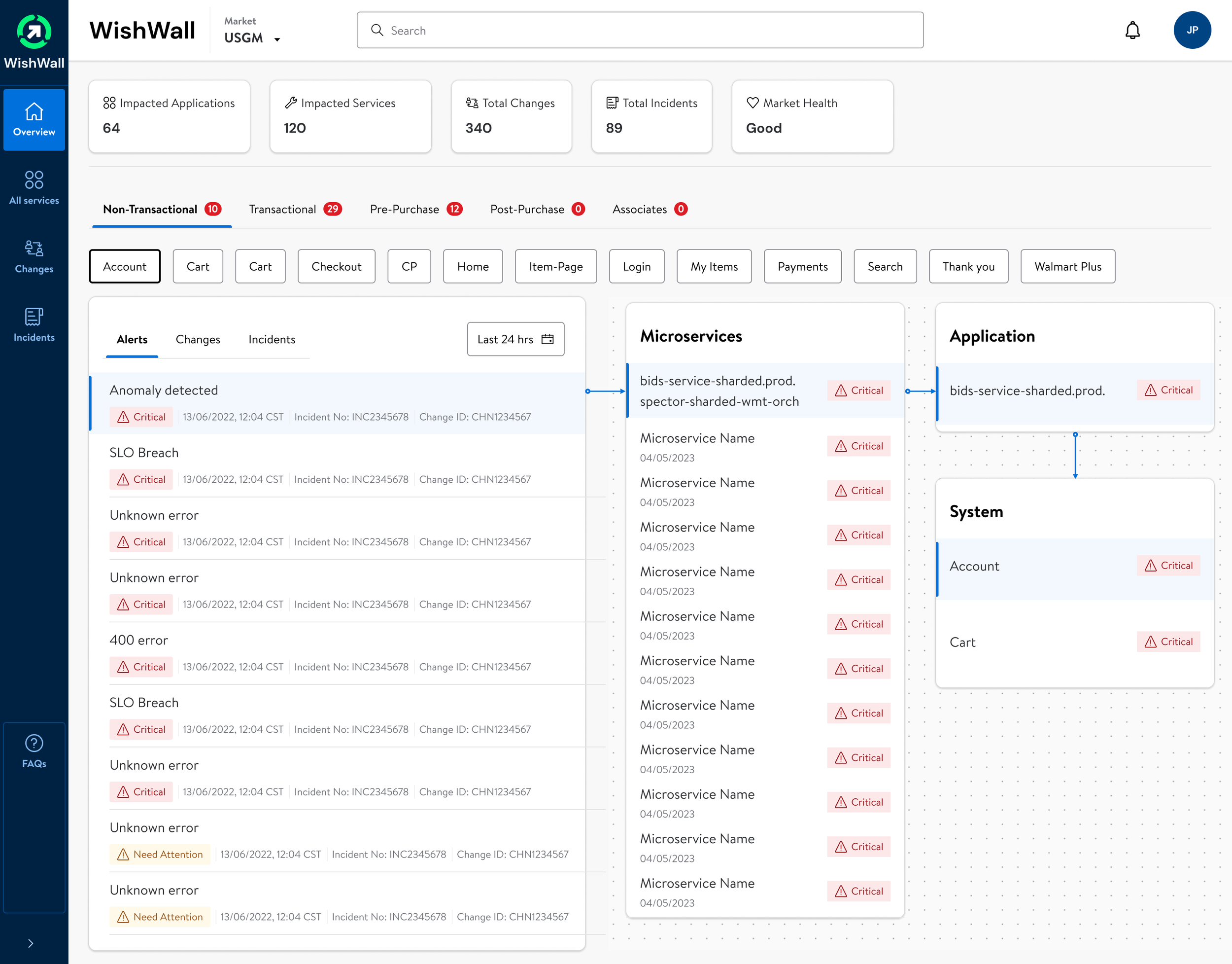
Enhanced Visualization: The new dashboard implemented a robust color-coding and iconography system to prioritize alerts and status levels, enabling users to gauge the system's health at a glance.
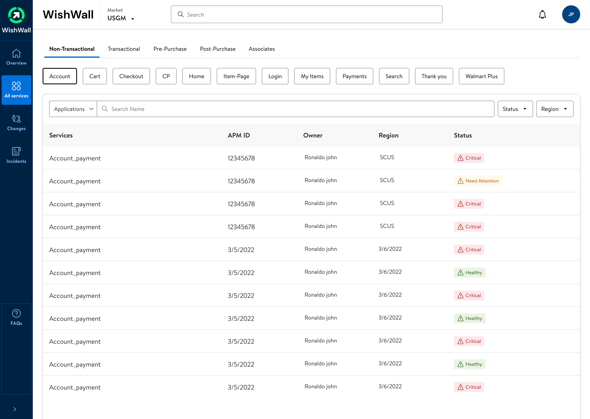
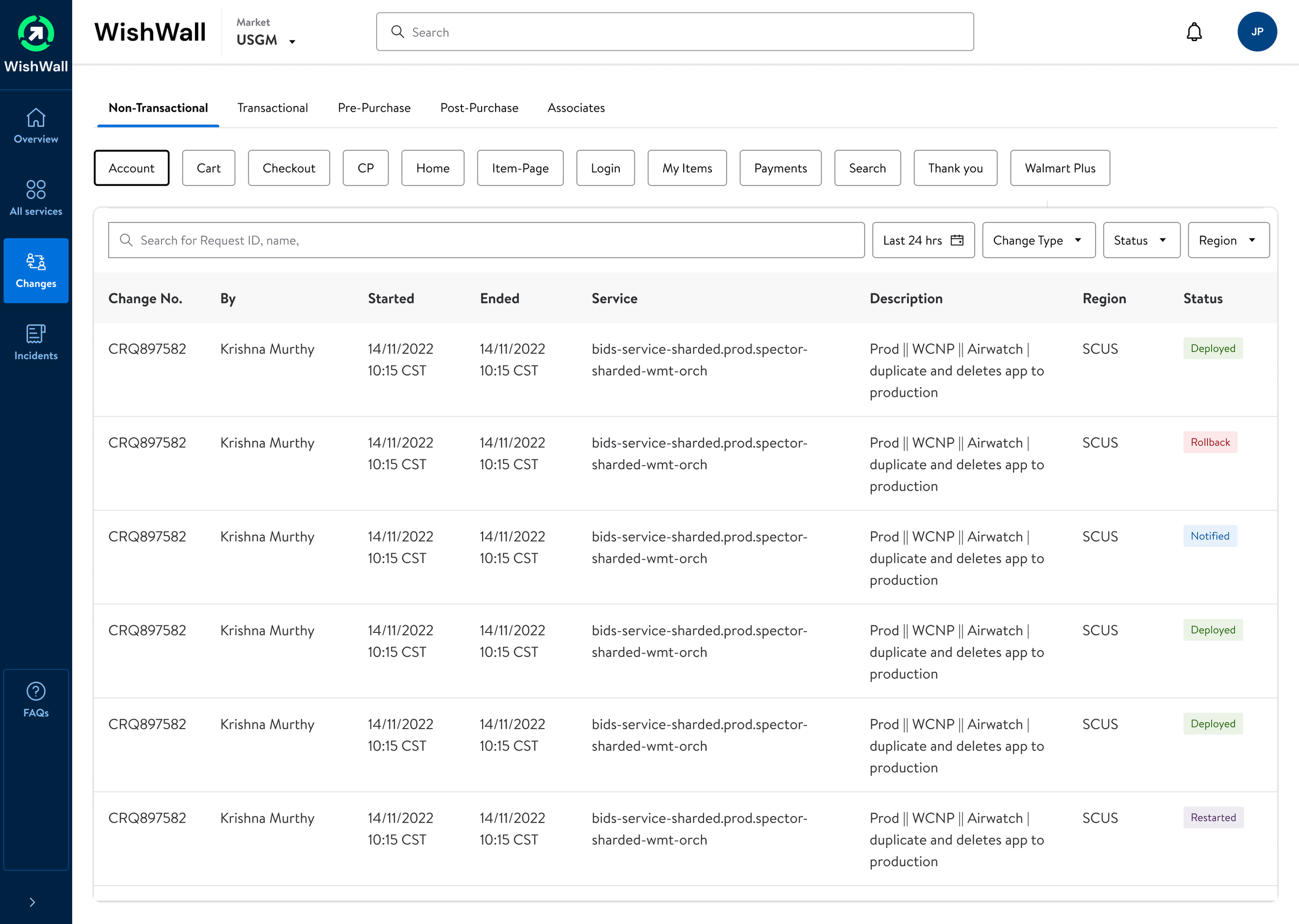
Streamlined Navigation: A restructured navigation pane allowed for quick access to different system views and essential functions, greatly reducing the number of steps to locate critical data.
Effective Alert Hierarchy: Alerts were categorized and displayed with an emphasis on criticality, allowing for quicker response times and more effective prioritization.
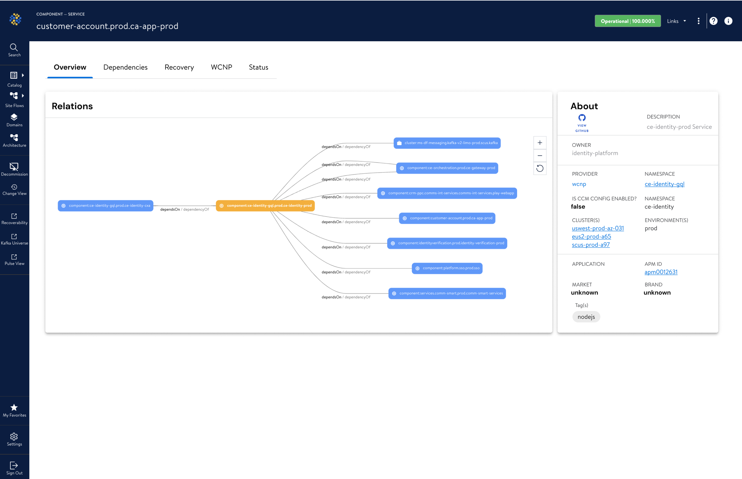
Integrated Data Sources: By synthesizing data from various sources, the dashboard provided a real-time, 360-degree view of the IT infrastructure, empowering users with up-to-date information.
Customizable Views: Users were given powerful filtering tools to create bespoke views that matched their specific monitoring requirements, improving personal and team productivity.
Optimized Layout: The dashboard made better use of screen real estate, presenting information in a clear and organized manner that facilitated quick decision-making.
Design Comparison (Overview Page)
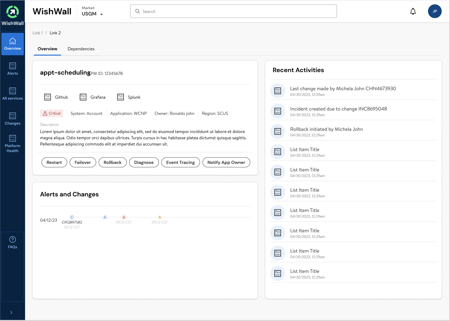
Clarity: Enhanced operational state visibility.
Navigation: Simplified tab-based interface.
Actionability: Direct operational controls.
Visibility: Immediate identification of critical issues.
Integration: Seamless tool access.
Activity Log: Instant recent activity review.
Trend Analysis: Graphical incident tracking.
Context: Detailed service information.