Situation: The Payment Calculator page on Lithia Motors’ Driveway platform was identified as having significant layout inconsistencies when compared with the standardized layouts of other Driveway web pages. This lack of consistency was affecting the user experience and the brand’s coherence.
Task: The objective was to standardize the layout of the Payment Calculator page, using two finance pages as references to establish layout standards. The project was focused on refining the page structure and styling, with an emphasis on minimal content changes to ensure the page aligned with the Driveway branded experience.
Action: I embarked on a layout standardization project, meticulously analyzing the inconsistencies and identifying elements that deviated from our layout standards. I reviewed the two finance pages that exemplified the desired Driveway aesthetic and functionality to derive a set of layout standards. Using these insights, I led a design refactor that focused on updating the page's structure, styling, and presentation, ensuring all changes adhered to the newly defined standards and enhanced the content’s clarity and navigability.
Result: The refactoring of the Payment Calculator page resulted in a design that not only aligned with the Driveway branding but also provided a consistent user experience across the platform. The new layout was received positively by users, evidenced by improved engagement metrics and a decrease in user-reported issues related to page navigation. This project set a precedent for future design updates, ensuring a cohesive and intuitive user experience that reinforces the brand's identity.

Why?
The Payment Calculator page design refactor was started as a layout standardization project, picking on a particular page that has many inconsistencies from other Driveway layouts. The two finance pages were pulled as examples build layout standards from. A refactor was used to keep content updates minimal, focusing on the page structure, styling and presentation of the content. The result is a page design that exemplifies a Driveway branded page.
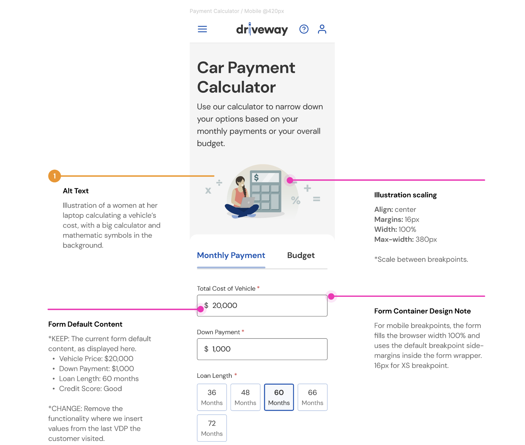
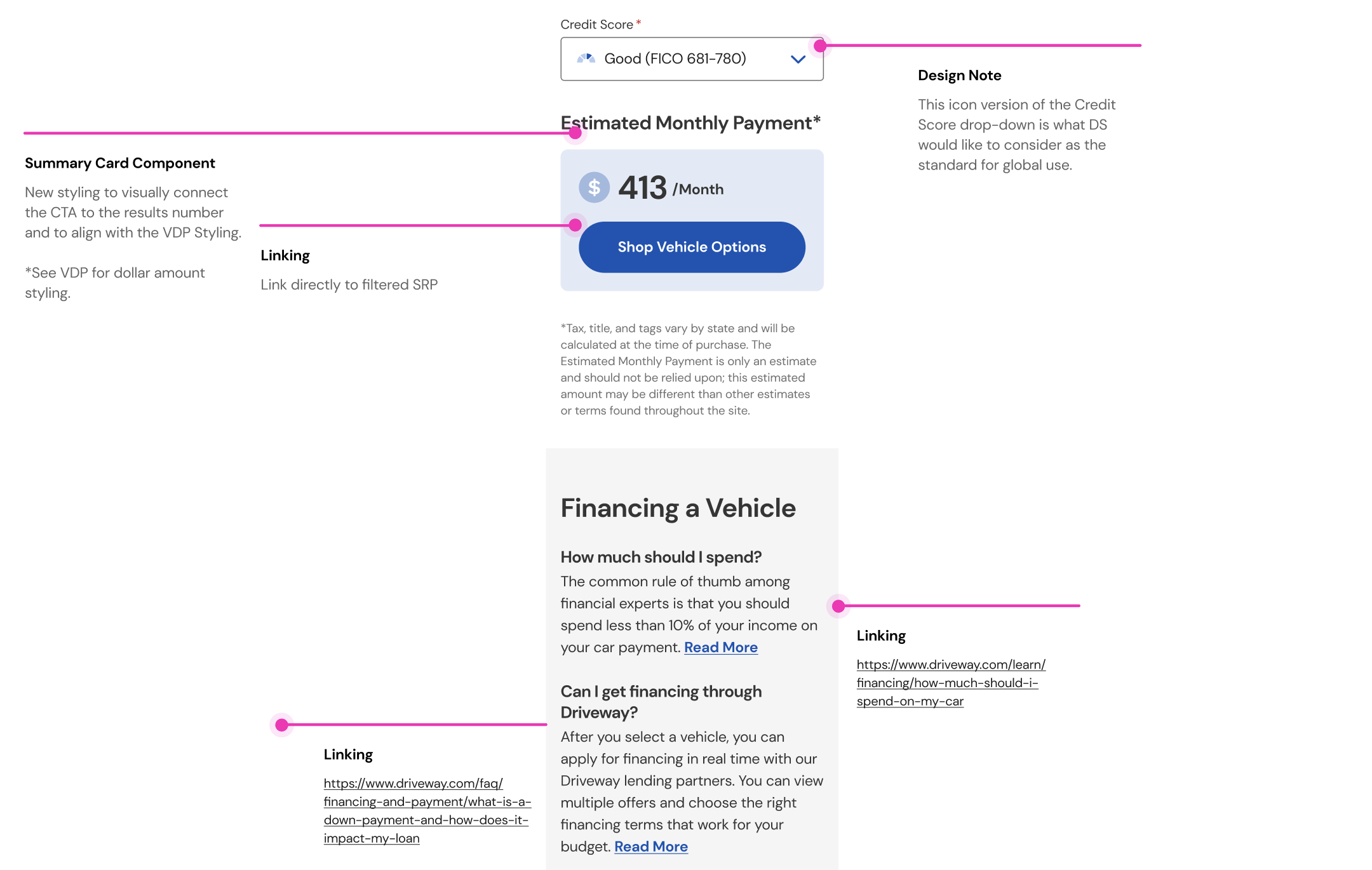
Layout Standardization
This is the idea of defining a starting point for building new layouts. The idea is that by defining basic entry design decisions, consistency would greatly increase and velocity would also increase. Layouts would be categorized by type, starting with “Marketing,” and styling decisions would be specific to the layout usage. Styling decisions include elements like default headline font-size, vertical spacing between elements, and grid usage.
Reframing the content
There are many more wins available for this page than just a design debit styling consistency update. The content in this example page had a lot of opportunties for improvement that would boost the page’s search performance. It was seen as a value add situation to improve the page’s content while refactoring the styling.
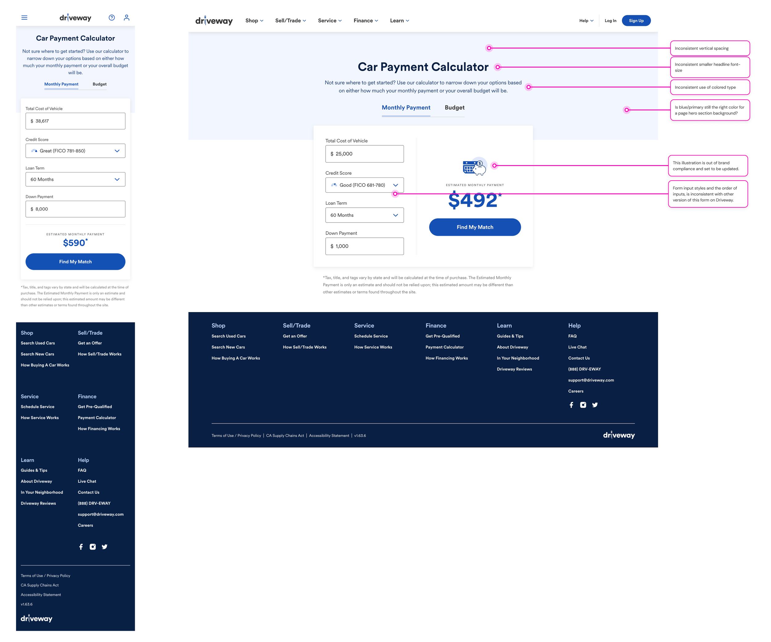
🚩 Problem Statement
The Payment Calculator page is out date with the brand styling.
• Use of color
• Font-sizes
• Vertical spacing
• Illustration style
ℹ️ Business Context
Additionally, this page has significant opportunities to increase the content volume to better educate customers and improve the page's SEO score.
The page risks losing customer trust by looking different than the rest of the product’s styling.
The Payment Calculator page plays an important role in multiple customer flows but has no dedicated journey related to this project.
Note that the customer’s calculator results can be carried through to the SRP as a filter.