Less detail. More signal.
Reduce linework and competing elements so the person and their action stay readable.

Making a car-buying experience feel a little more human. A study in illustration, skin tone, and the details that make us feel represented.
Explore the thinking behind the pixels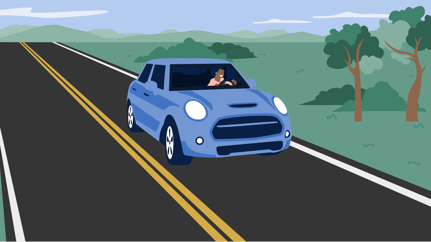
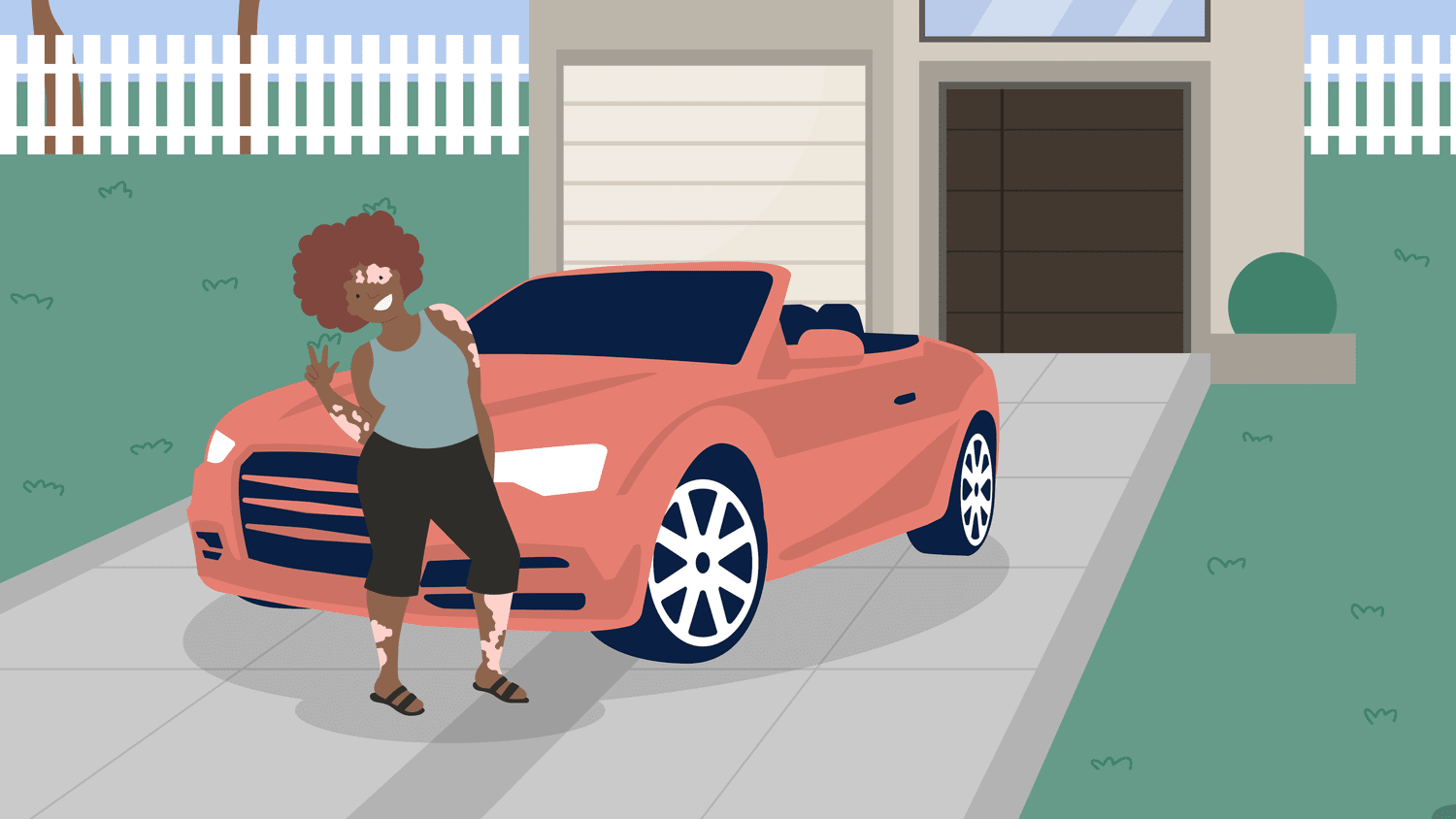 Different people.
 One visual language.
Before someone buys a car, they need to understand the journey—and feel comfortable taking the next step.
Driveway’s illustrations supported FAQs, guidance, and transaction stories. The opportunity was to create a visual language that felt approachable, represented a wider range of people, and stayed clear in smaller product spaces.
My contribution centered on translating character narratives into illustrations, exploring style and color, and refining the work through critique.
Reduce linework and competing elements so the person and their action stay readable.
Explore skin tone and hair color deliberately, alongside pose, context, and personality.
Let each character feel distinct without losing a consistent brand language.
How can an illustration feel unmistakably on brand
and meaningfully human?
Study 1 explored how to simplify the style. Study 2 explored how characters and settings could make the story more personal.
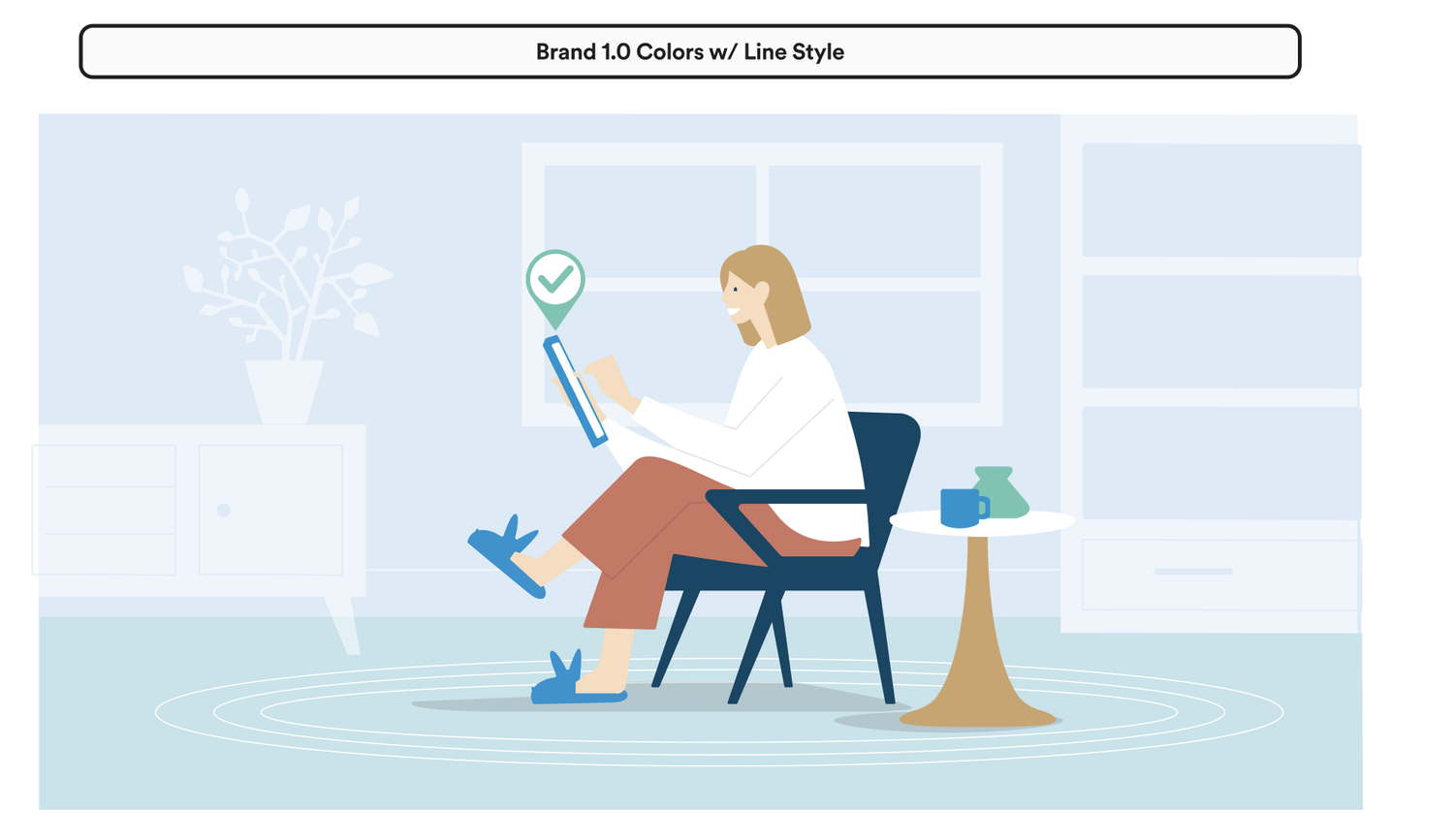
The original treatment used a full environment, fine lines, and the earlier brand palette. This gave the scene context, but created an opportunity to simplify illustrations for smaller placements.
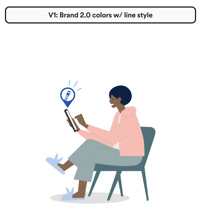
The Brand 2.0 exploration shifted color and character styling while retaining linework. It made the style change tangible enough to compare during review.
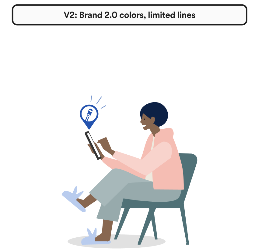
Reducing lines preserved depth while simplifying the visual. Review feedback favored its comfort and simplicity, with an expectation that it would read better at smaller sizes.
FROM THE DESIGN REVIEW“There’s more depth with this style but it’s not more complex.”
Skin tone became an explicit review topic. The project referenced the ten-shade Monk Skin Tone scale and explored a separate hair-color range alongside the brand palette.
Select a swatch. Change its surroundings. Notice how the same color can read differently.
Skin tone does not define a person’s goals or behavior. Gesture, context, and story communicate what the character is doing.
Read skin, hair, clothing, and background together. A wider palette still needs clear separation and visual balance.
A shared reference makes color choices easier to discuss and revisit across the illustration family.
Explore six character stories from the original collection. Each expands from an individual into a setting, an action, or a product moment.

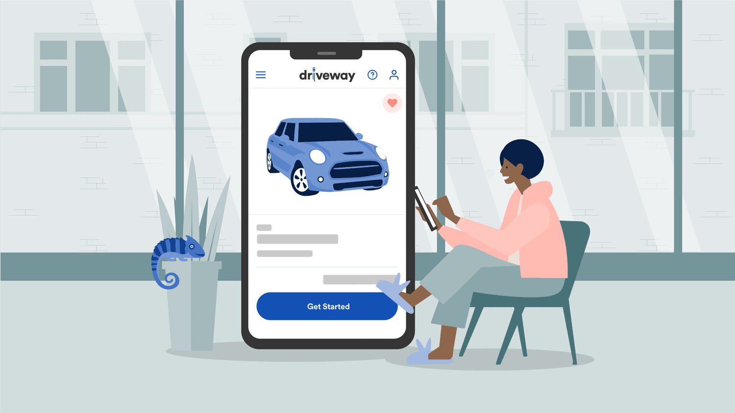
A relaxed posture, a familiar device, and an everyday setting give an abstract shopping journey a human point of entry.
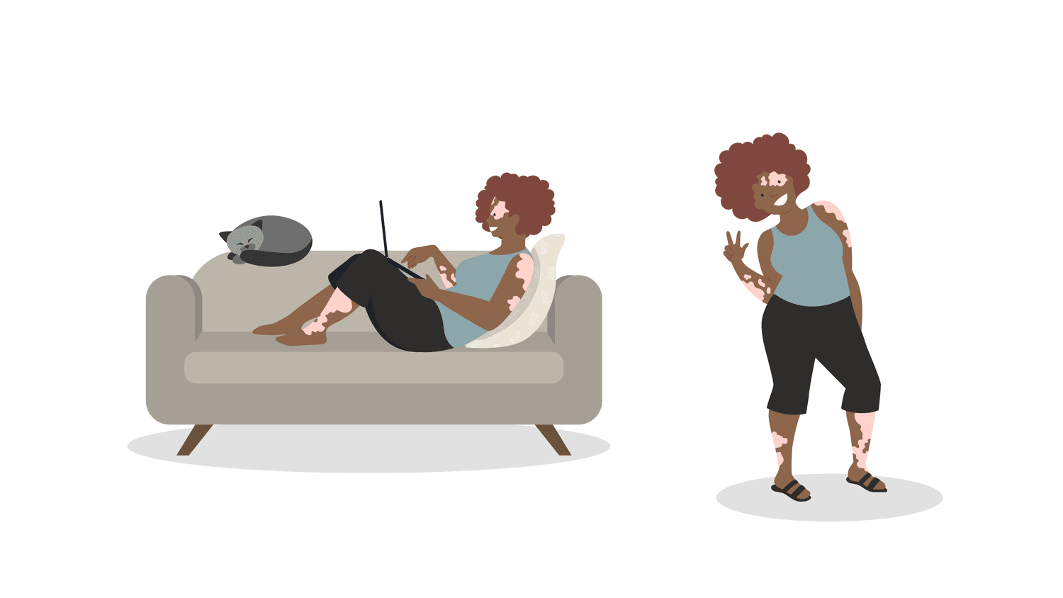
A curl silhouette, a quiet moment on the sofa, and a warm palette make the character recognizable across different compositions.
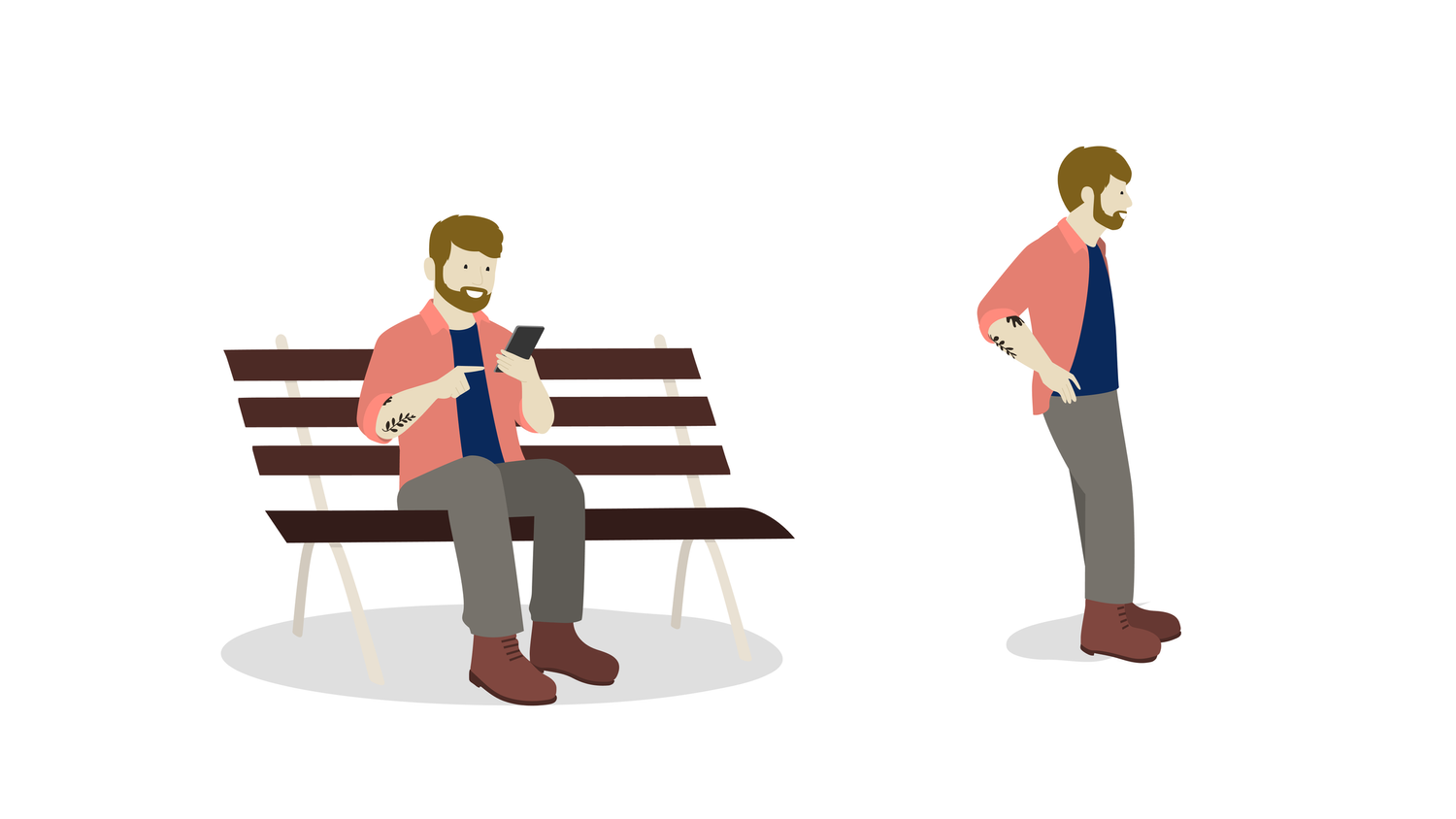
A family, a dog, and an outdoor setting create a small story around the vehicle. The recurring character connects the scene to the product experience.

Hair, accessories, posture, and a café environment add character while preserving the shared visual language of shapes and color.
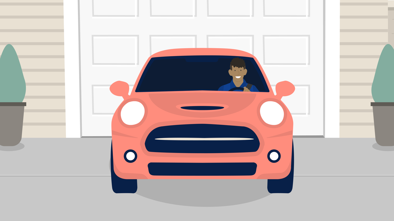
A consistent service uniform and a clear key-handoff gesture help turn a logistical step into an understandable interaction between people.
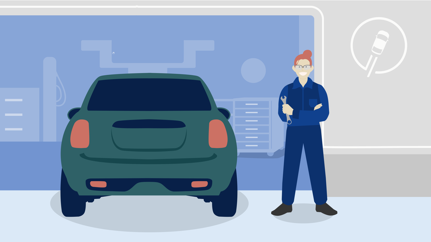
Tools, posture, and the workshop setting establish a service role through what the character does. The same character stays recognizable across tasks.
The review favored quieter environments that let the person and the product carry the narrative. A device can bridge the illustrated world and the actual task, while small details add personality without taking over.
Feedback: Quieter backgrounds helped the foreground tell the story.
Design rationale: Lower the environment’s visual emphasis so the character, device, and action form the first read.
Feedback: The simpler, reduced-line treatment felt comfortable and retained depth.
Design rationale: Use larger color shapes and a recognizable silhouette. Evaluate small placements separately rather than assuming a large illustration will scale well.
Feedback: Reviewers responded positively to the small character details and the device connection.
Design rationale: Keep a few memorable cues—hair, gesture, an accessory, or a companion—while allowing the scene’s primary action to remain clear.
The work brought style exploration, color references, stakeholder critique, and character storytelling into one illustration collection.
These describe the project artifacts. Engagement or conversion impact was not verified for this case study.
A compelling character is more than a color treatment. The strongest result comes from balancing representation, readable form, a consistent brand language, and a story that makes sense in the product.
RecognitionCan people identify the same character across scenes?
ComprehensionDoes the image help explain the intended action?
RepresentationDo a diverse range of participants find the characters relatable?
Proposed evaluation questions, not completed research findings.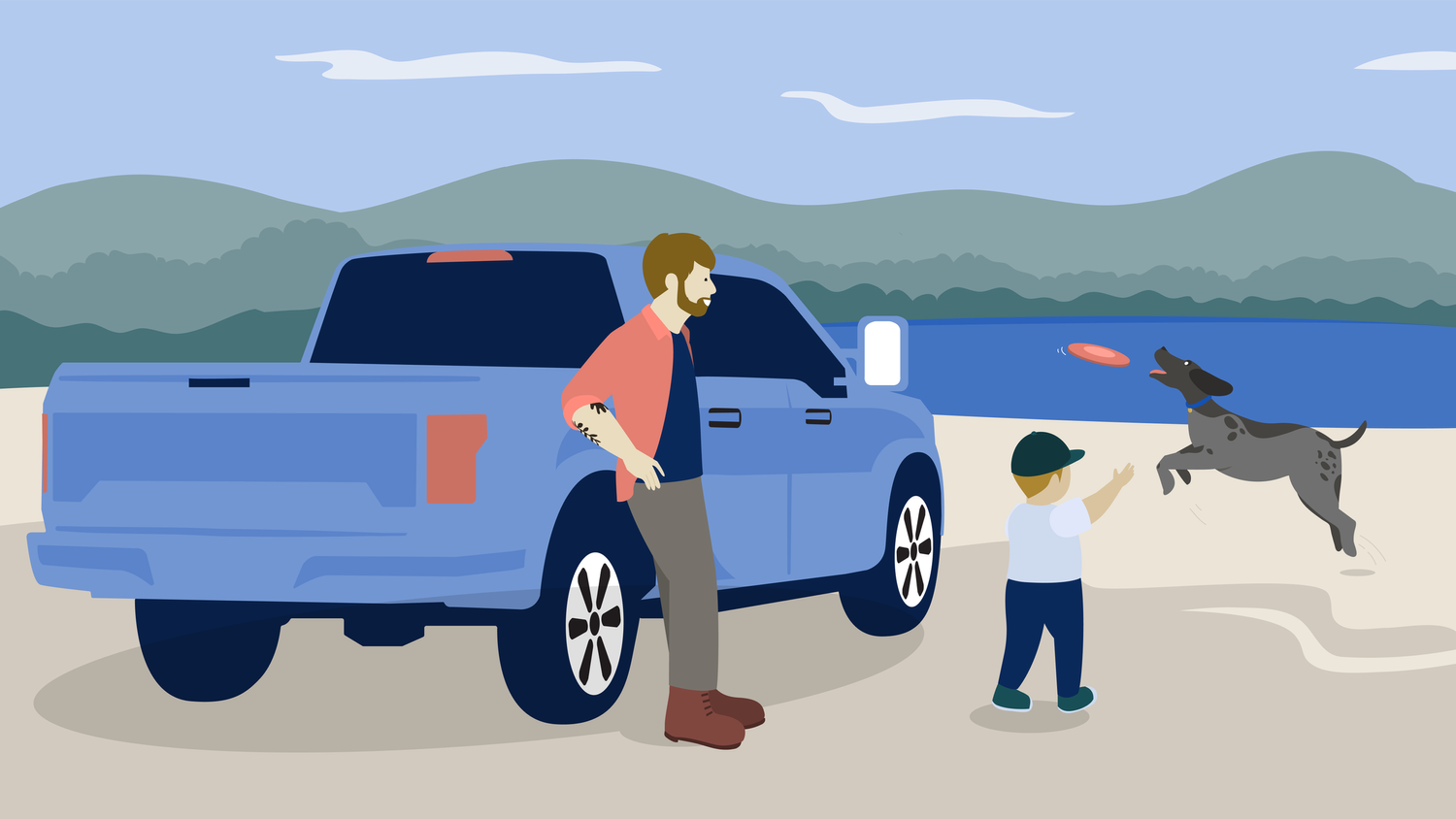 Design for the journey.
Original project artwork and critique materials by Priyansh Gandhi and the Lithia / Driveway project team. This retrospective organizes the documented explorations into a decision-led narrative; interactive inspection tools are additions for this presentation.